
Design responsive decks
Responsive design matters when someone will read the deck as a web page, inside another workspace, or on a tablet or phone.
1. Finish the main deck ratio first
Section titled “1. Finish the main deck ratio first”Design the deck in its main ratio, such as 16:9, before you tune the other views.
2. Open device preview
Section titled “2. Open device preview”Click the device/aspect control in the toolbar.
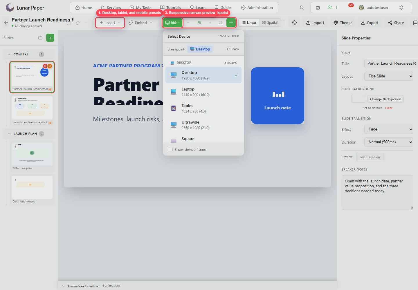
3. Check tablet and mobile presets
Section titled “3. Check tablet and mobile presets”Check how the text wraps, whether images crop, and whether the important content is still visible. Avoid dense layouts that make the viewer zoom in to read them.
4. Select problem elements
Section titled “4. Select problem elements”Select any element that does not work at a smaller breakpoint, then open the position or responsive controls in the properties panel.
5. Add responsive overrides
Section titled “5. Add responsive overrides”For tablet or mobile, adjust:
- Hidden state.
- Grid column and span.
- Vertical position.
- Height.
- Text size.
6. Recheck slide order and notes
Section titled “6. Recheck slide order and notes”People often read a responsive export on their own rather than in a live session. Make sure the speaker notes, the narration, and the slide titles still make sense without a presenter in the room.
7. Export or share
Section titled “7. Export or share”Use Web Page export or local sharing when the deck has to adapt to the screen it lands on. Use PDF or PowerPoint when it should stay fixed. Import and export presentations covers the settings for each format.