
Colours and contrast
Colours are the part of a brand most likely to fail an accessibility check, so the module grades them rather than just storing them.
Palettes
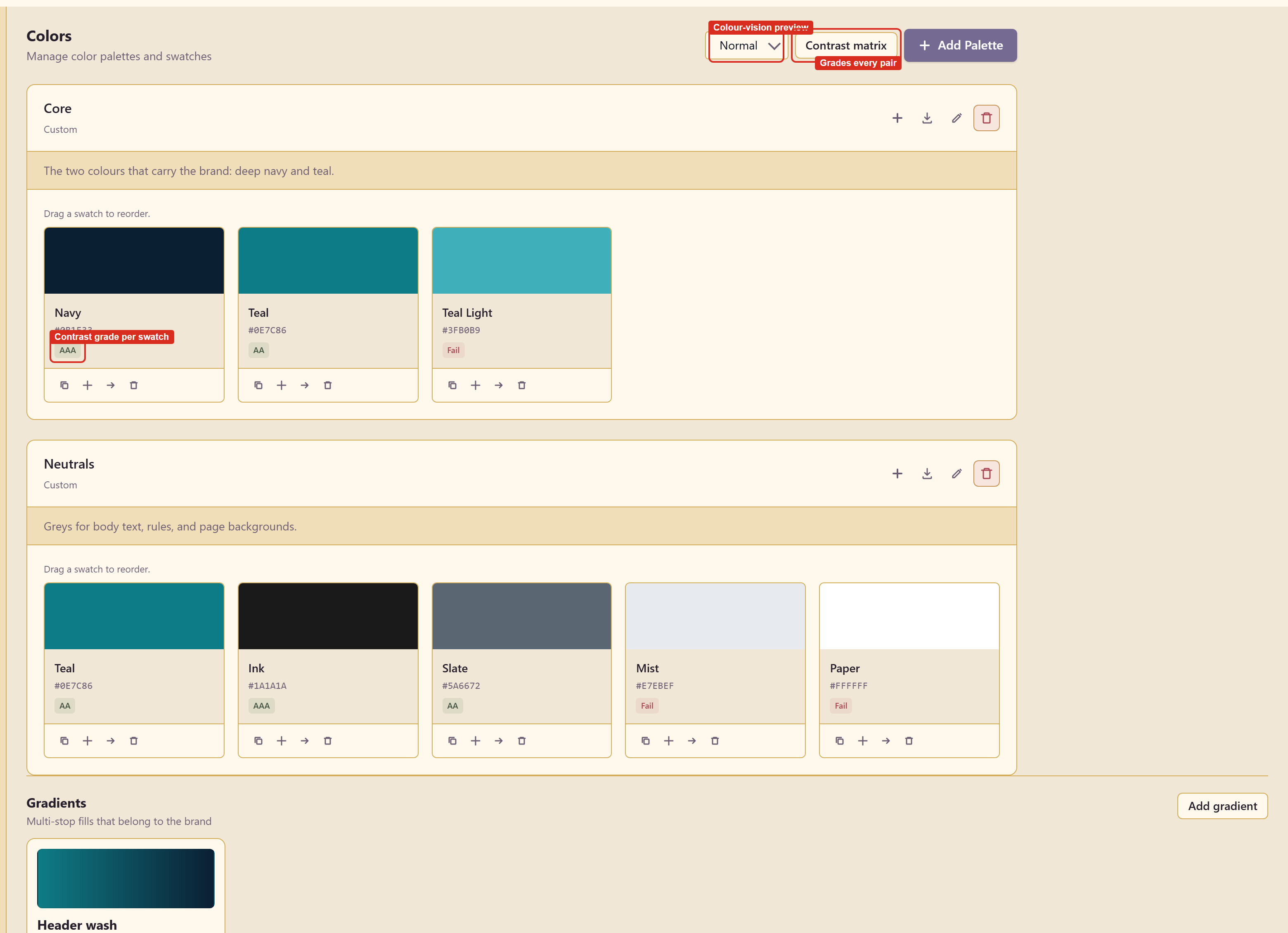
Section titled “Palettes”Add Palette creates a named group with a type and a description. Palettes are how you separate the two or three colours that carry the brand from the greys that do the work.
Each palette card carries four icon buttons: add a colour, import colours, edit the palette, and delete it. Swatches inside a palette can be dragged to reorder.
Swatches
Section titled “Swatches”Add Color opens a dialog that does more than take a hex value.
| Field | What it holds |
|---|---|
| Color Name | What people call it |
| Hex Value | The value, with RGB and HSL shown alongside |
| Token Name | The CSS custom property name, such as --color-primary |
| Usage Notes | What the colour is for |
Grading
Section titled “Grading”The dialog shows contrast against white and against black as you type, each with its WCAG grade, and Light / Dark / Check preview the colour in context.
Every swatch then carries that grade on its card: AAA, AA, or Fail.
Read the grade as a constraint, not a score. A Fail colour is not a bad colour — a pale tint that fails against white is perfectly good as a background. What the grade tells you is that it cannot carry text.
The contrast matrix
Section titled “The contrast matrix”Contrast matrix grades every pair of colours in the brand at once.
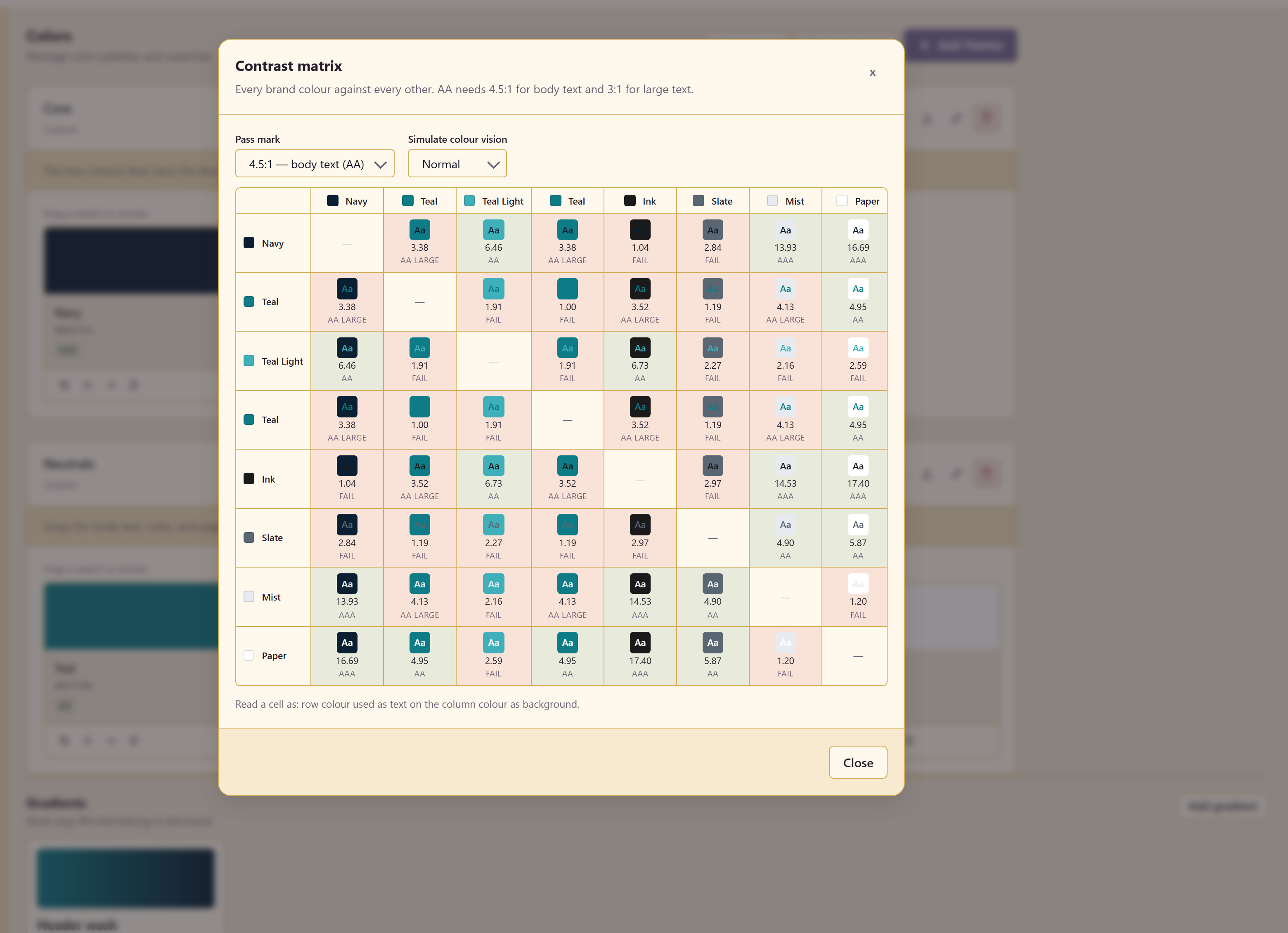
This is the view that catches the combination nobody tested. Individual swatches passing against white says nothing about your teal on your navy.
The colour-vision simulator
Section titled “The colour-vision simulator”The dropdown beside it previews the palette as people with colour vision deficiencies see it.
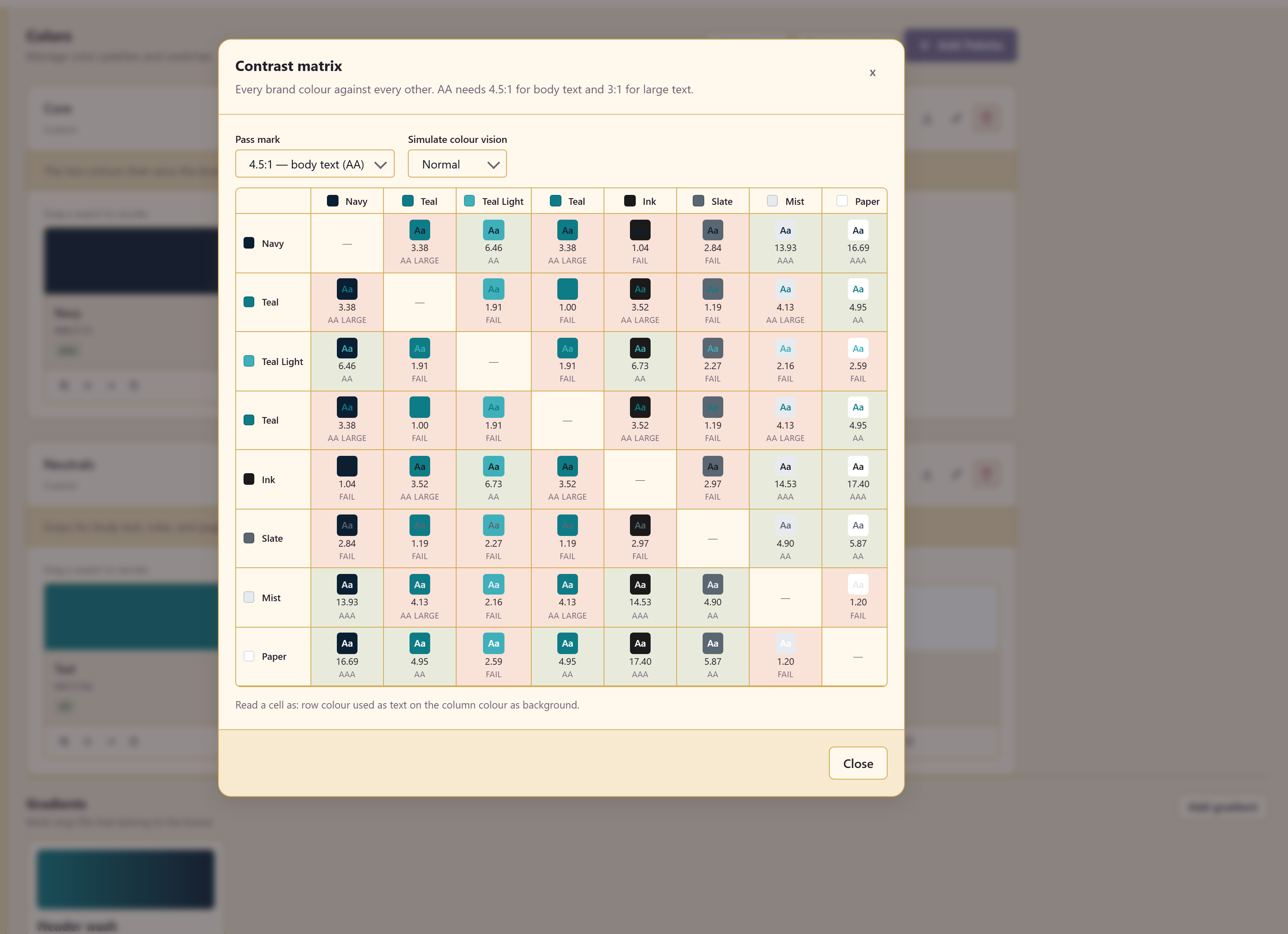
Check any palette where two colours carry different meanings — a status green and a status red, a chart series. If they converge in the simulator, the palette is encoding information in a way some readers cannot decode.
Gradients
Section titled “Gradients”Gradients are stored on the brand rather than recreated per design.
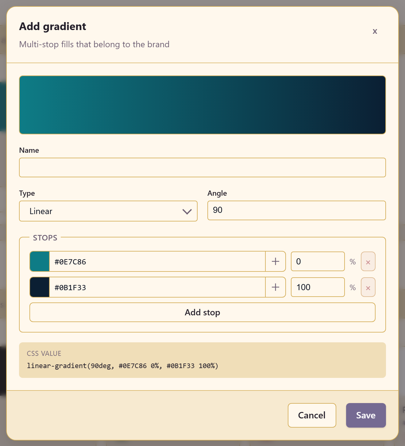
A gradient has a name, a type, an angle, and a list of stops, each with a colour and a position. Add stop adds more, and the CSS value updates live — linear-gradient(90deg, #0E7C86 0%, #0B1F33 100%) — with Copy CSS on the finished card.
Keep the stop count low. Two or three stops read as a considered gradient; six read as a mistake.
Related
Section titled “Related”Design tokens carries these values into code. Brand controls restricts which of them people may use.