
Typography
Typography holds three things, each with a count on its tab: Fonts, Type Scales, and Text Styles.
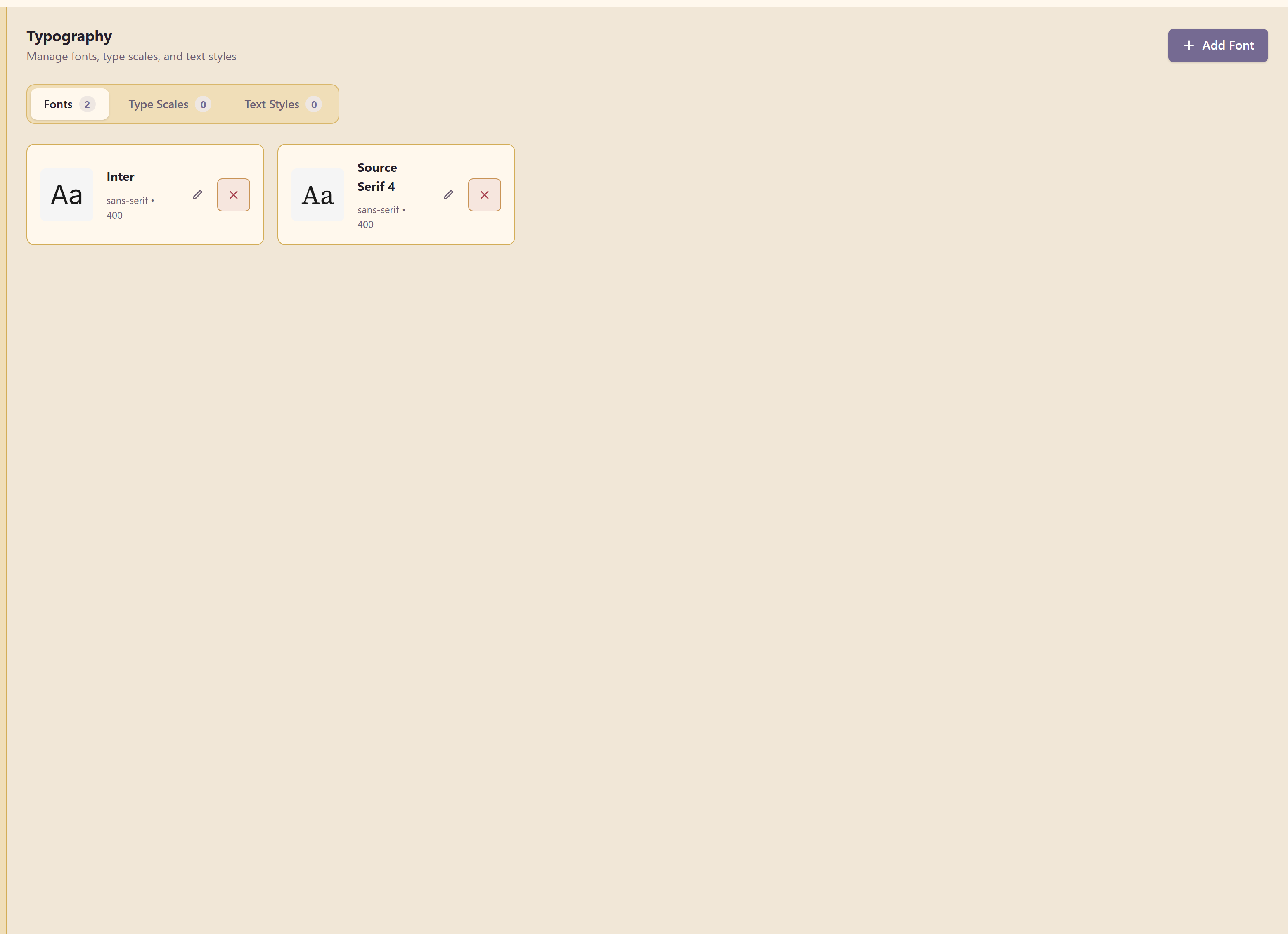
Fonts are the faces themselves. Type scales are the size steps. Text styles are named combinations — a heading, a caption — that other modules can apply in one go.
Adding a font
Section titled “Adding a font”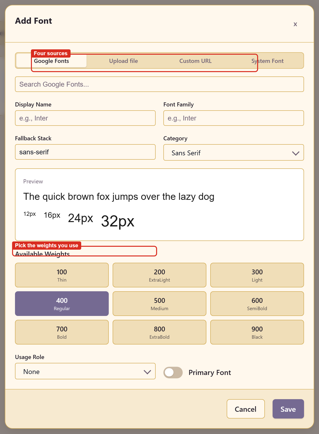
Four sources sit across the top.
| Source | Use it for |
|---|---|
| Google Fonts | Anything in the Google library, with a search box |
| Upload file | A licensed font file you hold |
| Custom URL | A font hosted somewhere you control |
| System Font | The stack already on the reader’s machine |
The fields
Section titled “The fields”Display Name is what people call it. Font Family is what CSS asks for. Fallback Stack is what renders if the font does not load, and it defaults to sans-serif.
Set the fallback deliberately. It is the font a reader actually sees on a slow connection or a locked-down machine, and leaving it generic is a decision by default rather than a decision.
Category files the font as sans serif, serif, and so on.
Weights
Section titled “Weights”Available Weights runs 100 Thin through 900 Black, and you pick the ones the brand uses.
Choose fewer than you think. Every extra weight is another file the reader downloads, and most brands work with two — a regular and a bold — plus one display weight if the headings need it.
Preview
Section titled “Preview”The specimen renders at 12px, 16px, 24px, and 32px while you choose.
Look at the 12px line hardest. Most type looks good at 32px; the small size is where a face either holds together or does not.
Usage role
Section titled “Usage role”Usage Role and the Primary Font checkbox mark which font leads. Other modules use that to decide what to apply by default.
Related
Section titled “Related”Design tokens exports type values alongside colour. Brand controls can restrict which fonts people may use.