
Component library
The Documents module ships with 57 components grouped into eight categories. Each component is a self-contained block with its own data, properties, and formatting. You add them from the left Components panel or with the slash command.
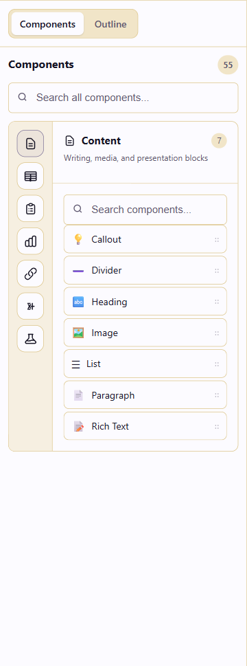
The panel header shows the total component count. Below the search box, the Categories row lets you jump to a category. Each category section lists its components with an icon, name, and short description.
Inserting a component
Section titled “Inserting a component”There are two ways to add a component to the canvas:
-
Slash command. Click any Click to add content area on the canvas, type
/, then type the component name. PressEnterto insert it.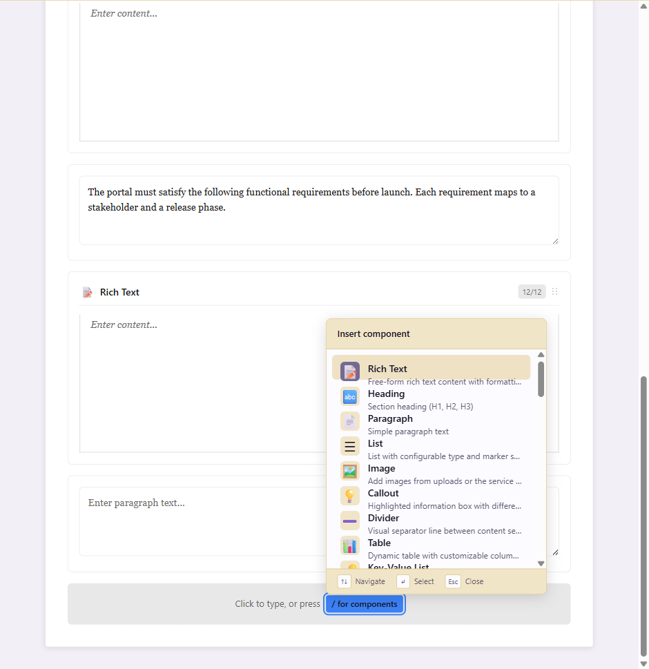
-
Component library. Open the Components tab in the left panel, pick a category, and click a component to insert it at the current insertion point.
Content (7)
Section titled “Content (7)”Writing, media, and presentation blocks. The default category when the panel opens.
| Component | Purpose |
|---|---|
| Callout | Highlighted information box with info, warning, success, or error styles. |
| Divider | Visual separator line between content sections. |
| Heading | Section heading at H1, H2, or H3 level. |
| Image | Add images from uploads or the service asset library. |
| List | Configurable list with marker style and type. |
| Paragraph | Simple paragraph text. |
| Rich Text | Free-form rich text with formatting, links, and embedded lists. |
Layout (2)
Section titled “Layout (2)”Page and section boundaries, available in every document type. Both components occupy the full width and sit between content components.
| Component | Purpose |
|---|---|
| Page Break | Starts the following component on a new page while keeping the current section layout. Has no settings beyond its position. |
| Section Break | Starts a section with inherited, document-default or custom paper size and orientation. Supports Next Page, Continuous, Odd Page and Even Page. |
Select a Section Break marker to configure it in Properties. See Layout and page breaks for the settings and a portrait-to-landscape example.
Reference (8)
Section titled “Reference (8)”Tables, glossaries, definitions, and supporting reference blocks.
| Component | Purpose |
|---|---|
| Acronyms | Acronym expansions and abbreviations table. |
| Definitions | Numbered definitions table. |
| Document Info | Document metadata including title, description, and version. |
| Glossary | Term definitions and glossary entries. |
| Key-Value List | List of key-value pairs for metadata and facts. |
| Table | Dynamic table with customizable columns and rows. |
| Table of Contents | Auto-generated navigation from document headings. |
| Version History | Document version history and change tracking as content. |
Requirements (7)
Section titled “Requirements (7)”Structured requirement capture for product and engineering documents.
| Component | Purpose |
|---|---|
| Acceptance Criteria Matrix | Acceptance criteria with status, owner, and priority. |
| Data Requirements | Data needs, sources, and schema details. |
| Functional Requirements | Functional requirement statements with IDs and priorities. |
| Functional Requirements (Basic) | Simpler functional requirements list. |
| Interfaces | Interface definitions between systems or modules. |
| Non-Functional Requirements | Performance, security, reliability, and other NFRs. |
| User Stories | User stories with acceptance criteria. |
Analysis (2)
Section titled “Analysis (2)”Stakeholder and context analysis.
| Component | Purpose |
|---|---|
| Stakeholders | Stakeholder list with roles, influence, interest, and engagement. |
| System Context | System context diagram or description. |
Integration (3)
Section titled “Integration (3)”Components that embed content from other service modules.
| Component | Purpose |
|---|---|
| Dashboard / Report | Embed a published dashboard or report from the service. |
| Data Hub Embedding | Embed a connected Data Hub table or published view. |
| Flowchart | Embed a flowchart from the service. |
Math (8)
Section titled “Math (8)”Mathematical content components.
| Component | Purpose |
|---|---|
| Algorithm | Algorithm and pseudocode blocks with line numbering and syntax highlighting. |
| Code + Math | Side-by-side code and mathematical equivalent. |
| Constants Reference | Reference table of physical and mathematical constants. |
| Equation | Mathematical equation with LaTeX syntax and live preview. |
| Matrix | Matrix input with operations like transpose and determinant. |
| Numbered Equation | Auto-numbered equation with cross-reference label. |
| Proof Environment | Formal proof structure with QED markers and case analysis. |
| Theorem Block | Theorem, lemma, proof, and definition blocks with numbering. |
Science (20)
Section titled “Science (20)”Research, chemistry, and scientific reporting components. This is the largest category.
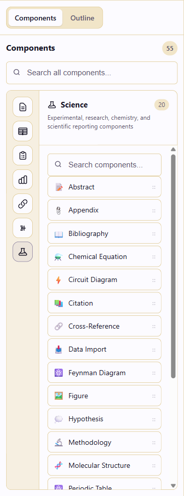
| Component | Purpose |
|---|---|
| Abstract | Document abstract with structured fields. |
| Appendix | Appendix section for supplementary material. |
| Bibliography | Cited sources and references. |
| Chemical Equation | Chemical equations with notation, subscripts, and reaction arrows. |
| Circuit Diagram | Circuit diagram component. |
| Citation | Inline citations linked to bibliography entries. |
| Cross-Reference | Reference to a numbered component elsewhere in the document. |
| Data Import | Import data for tables and charts. |
| Feynman Diagram | Feynman diagram component. |
| Figure | Captioned figure block for images and diagrams. |
| Hypothesis | Hypothesis statement block. |
| Methodology | Methodology section for research documents. |
| Molecular Structure | Molecular structure display. |
| Periodic Table | Periodic table reference. |
| Scientific Graph | Graph component for scientific data. |
| Scientific Table | Data table with scientific notation, uncertainty, and statistics. |
| SI Prefixes | SI prefix reference table. |
| Significant Figures | Significant figures helper and reference. |
| Statistical Analysis | Statistical analysis block. |
| Unit Converter | Unit conversion helper. |
Blocks in use
Section titled “Blocks in use”- Build content with components walks through inserting and editing these blocks.
- Use reference components goes deeper on the Reference category.
- Editor reference covers the panels around the canvas.