
Dashboards quickstart
This builds a working dashboard from nothing: a data source, a canvas, four widgets, and a published link. It takes about fifteen minutes and leaves you with something real rather than a demo you throw away.
You need a service you can edit and a database or data file Data Hub can reach.
1. Give Data Hub something to read
Section titled “1. Give Data Hub something to read”Dashboards cannot open a database itself. Open Data Hub in the same service and create a connection to your source. Data Hub then scans it and registers each table as a managed dataset automatically — you do not create those by hand.
If you want a widget to show something other than a raw table — a monthly rollup, a filtered subset, a join — build a data view in Data Hub now. You can bind either a view or a dataset, but a view is usually easier to chart.
The examples here use a DuckDB file of restaurant data connected as Food sales (DuckDB), with a Monthly popularity view on top of it.
2. Create the dashboard
Section titled “2. Create the dashboard”Open Dashboards and choose + Create Dashboard.
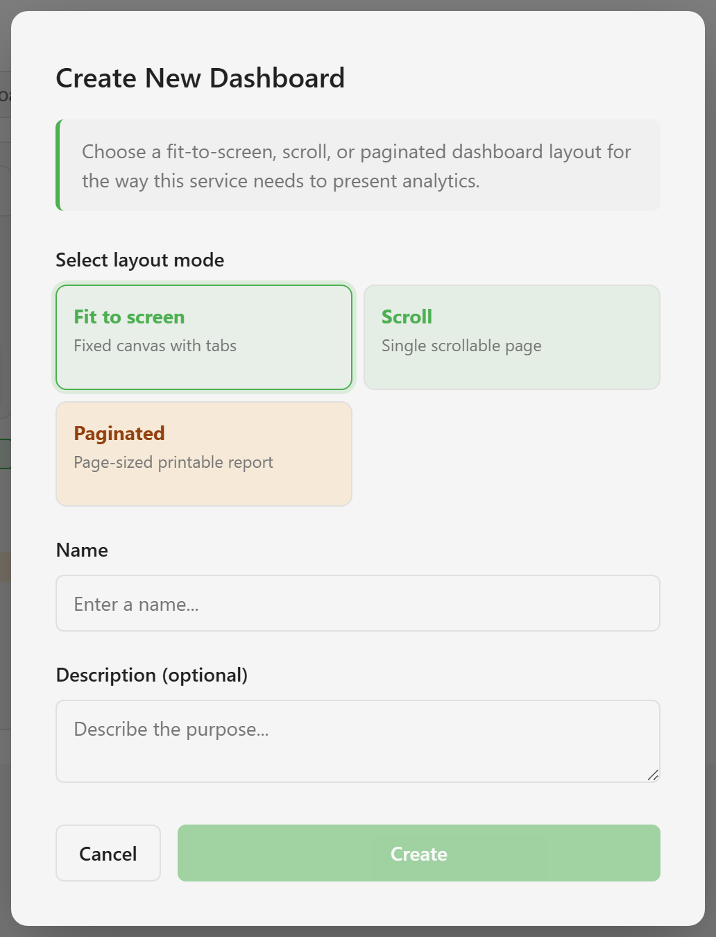
Pick Scroll. It is a single page you scroll down. That is the easiest mode to start with, and it copes best if you end up adding more than you planned.
Name it Food sales overview. Take the name seriously: a dashboard cannot be renamed after it is created, and neither can its layout mode be changed. Both are permanent.
Choose Create. The designer opens on an empty canvas.
3. Load the data panel
Section titled “3. Load the data panel”Choose Data in the toolbar. The panel lists everything bindable in this service, grouped under the connection it came from.
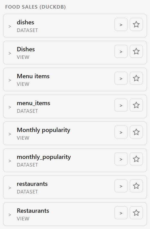
Each entry is tagged VIEW or DATASET. Expand one with the chevron to see its columns. The star-shaped Pin control pins the source to this dashboard and lists it under Pinned.
Before the AI can use your data, you must pin the datasets or data views in this dashboard. Connecting them in Data Hub alone does not make them available to dashboard AI. If you want help building the widgets, pin the sources first, then follow Dashboards and AI usage.
If the panel says there is nothing to show, the connection has not finished scanning, or it produced no tables. Troubleshooting covers both.
4. Add a KPI card
Section titled “4. Add a KPI card”Open Indicators in the Widget Library on the left and drag Kpi Card onto the canvas.
The card appears with no data. That is expected — it has no binding yet. Expand your view in the Data panel, find a numeric column, and drag it onto the card. The card now shows a number.
Dragging is the only way to bind a column. The properties panel lets you change a binding once it exists, but it cannot create one.
With the card still selected, open its properties and set the aggregation. Sum for counts, Average for ratings and scores. The default is rarely what you want.
5. Add a chart
Section titled “5. Add a chart”Drag Bar Chart from Charts onto the canvas below the card.
A bar chart needs two bindings, so drag twice: a text column for the categories, then a numeric column for the heights. Watch the properties panel as you drop — it shows which axis each column landed on.
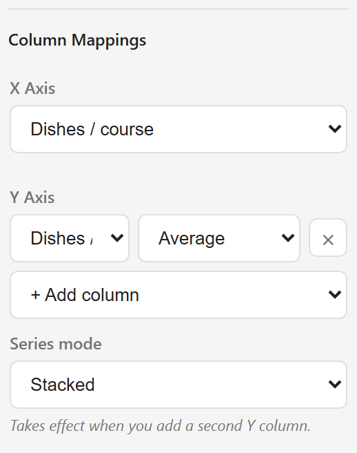
If a column lands on the wrong axis, change it here rather than deleting the widget and starting again.
6. Lay it out
Section titled “6. Lay it out”Drag widgets to move them, drag their edges to resize. Everything snaps to a 20-pixel grid, which keeps them lined up with each other.
Hold Shift to select more than one widget at a time. Note that Shift also switches snapping off while it is held, so a Shift-drag will land off-grid.
Leave room around each chart. A chart under 300 pixels wide will overlap its own axis labels.
7. Publish
Section titled “7. Publish”Choose Publish. The dialog asks where it should be hosted and offers a note for the version history.
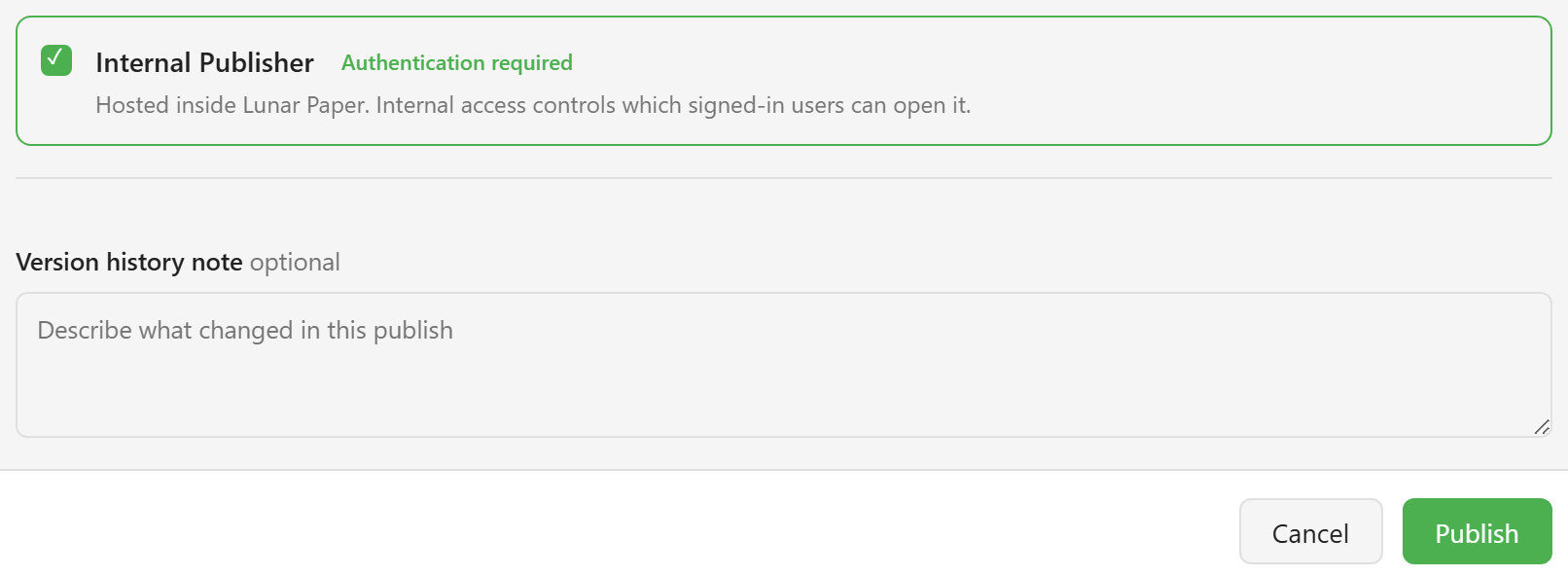
Internal hosts it inside Lunar Paper and requires viewers to be signed in. Add a note describing what changed — it is the only label the version gets.
Choose Publish. A View button appears in the toolbar next to Publish. That is the published dashboard as a reader sees it: no library, no properties panel, just the content with Full screen and Export data in the header.
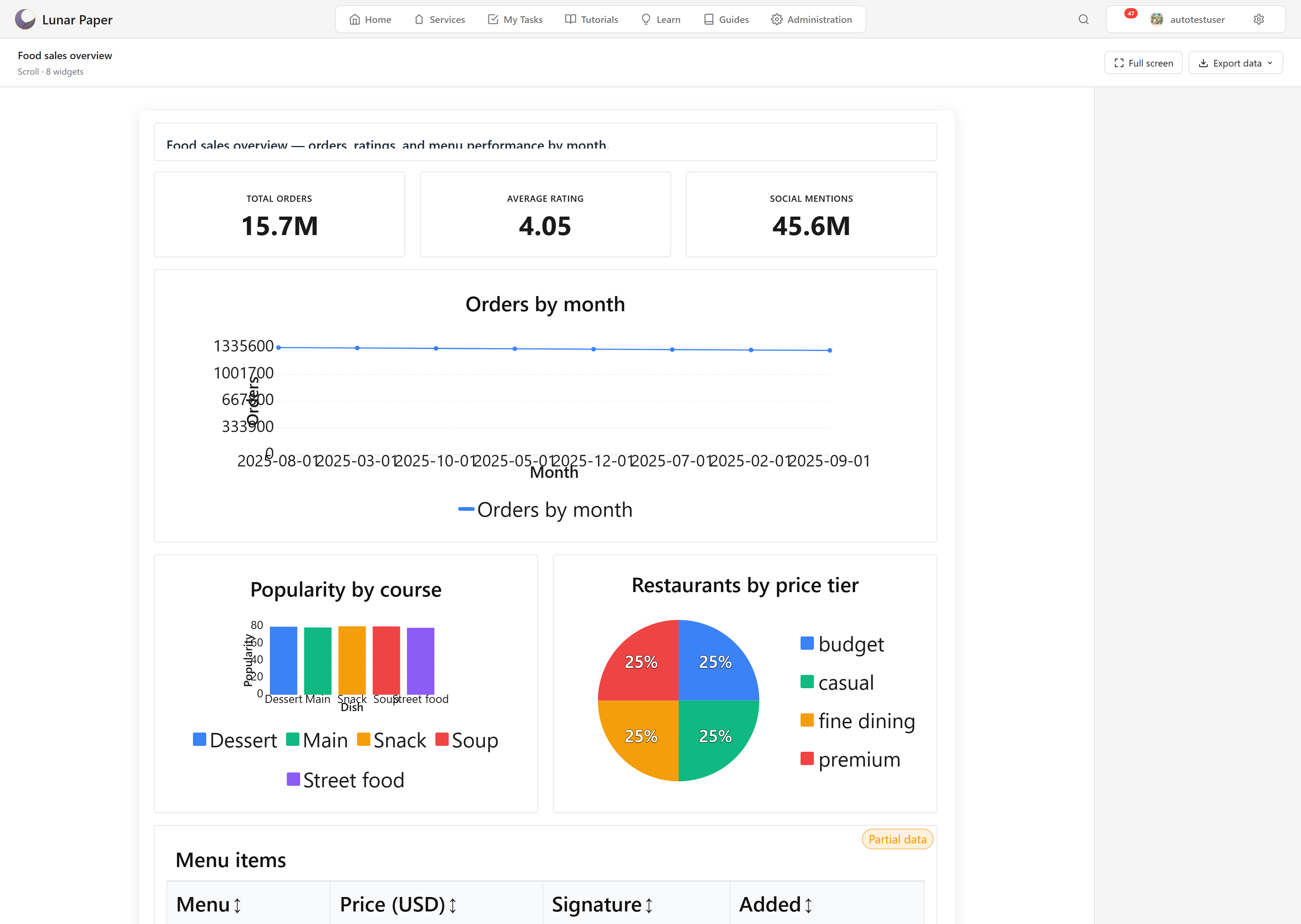
Publishing takes a snapshot. Editing afterwards does not change what readers see — the card in the module list marks the dashboard Unpublished changes until you publish again.
What you have
Section titled “What you have”You now have a dashboard that reads live data from Data Hub, laid out on a scroll canvas and published to everyone in the service who is signed in.
Add and bind widgets covers the binding rules this page skipped over: which widget needs which kind of column, and what each aggregation does. If you would rather the dashboard was emailed out on a schedule than opened by hand, Schedule a delivery sets that up.