
Build with blocks
Everything in an email is a block. This covers getting them onto the canvas, moving them around, and changing what they look like.
Find the block you want
Section titled “Find the block you want”The library sits on the left, split into four tabs.
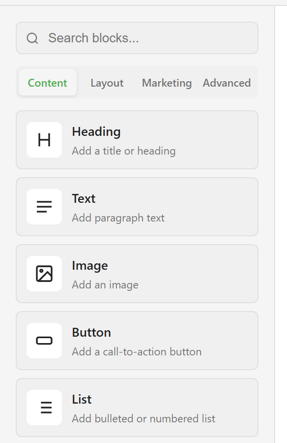
Content holds the five you use most: heading, text, image, button, list. Layout holds divider, spacer, columns, and card. Marketing holds the promotional pieces — testimonials, countdowns, pricing tables, product cards.
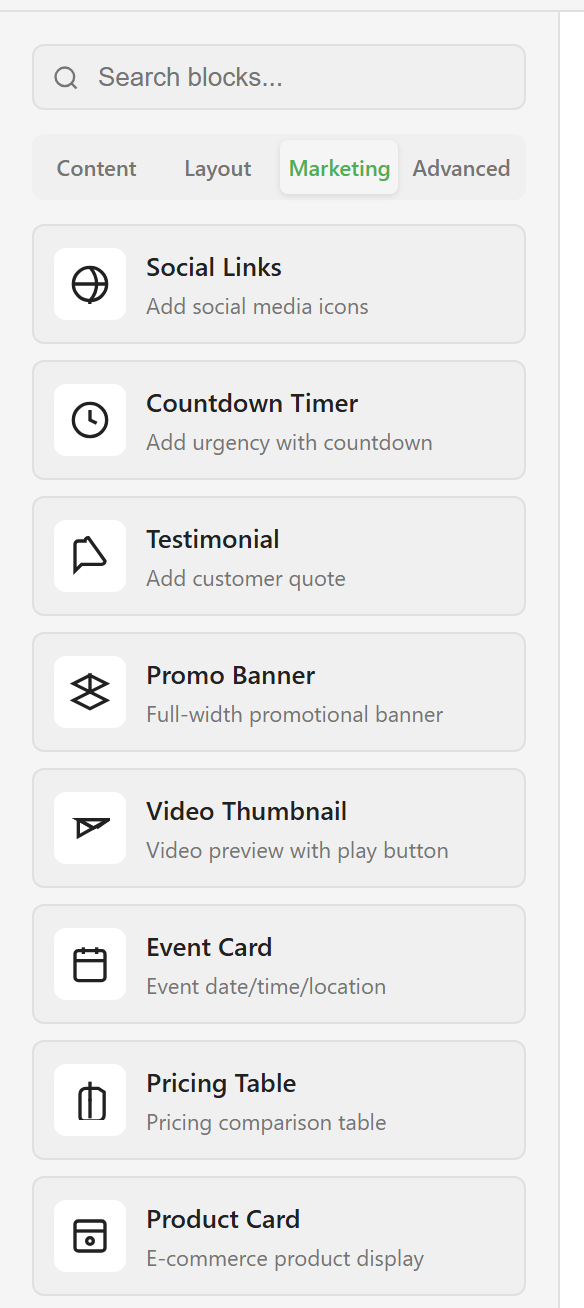
Advanced holds the rest, including footer, table, signature, and a raw HTML block.
The search box at the top searches all four tabs at once, so you do not have to know which tab a block is in. Searching for “footer”, for example, finds the footer block even though it lives under Advanced.
Block catalogue lists all 27 with what each one is for.
Add a block
Section titled “Add a block”Drag it from the library onto the canvas. Drop it between two existing blocks to insert it there rather than at the end.
The block arrives with placeholder content, which is deliberate — it shows you the shape before you commit to writing anything.
Edit it
Section titled “Edit it”Click a block to select it. The properties panel on the right fills with that block’s settings.
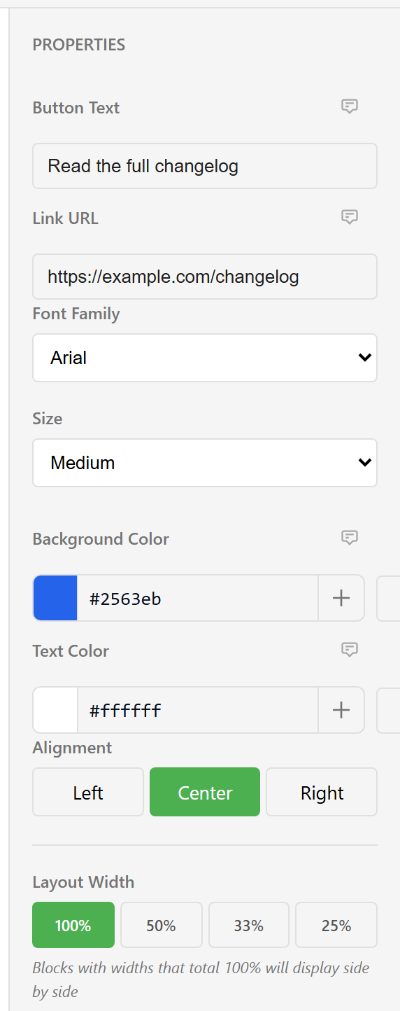
The fields differ by block type. A heading has content, level, font, alignment, and colour. A button adds a link, a size, and separate background and text colours.
Two things are on nearly every block. Alignment sets left, centre, or right. Layout Width controls columns, which the next section covers.
Colour fields show a swatch and a hex value, with a + to add that colour to your brand palette so you can reuse it.
Move, copy, and delete
Section titled “Move, copy, and delete”Hover a block and a small toolbar appears above it.
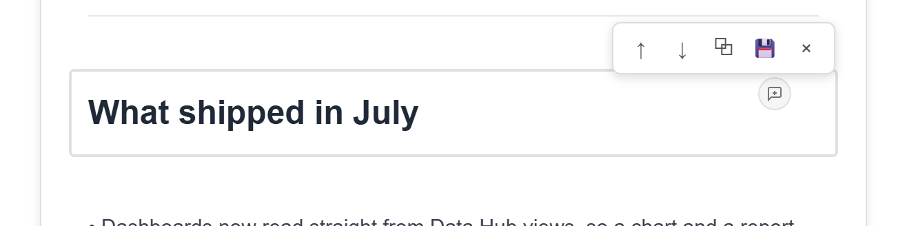
From left to right: move up, move down, duplicate, save as a snippet, delete. The speech bubble beside it opens comments on that block.
Duplicate is the fastest way to build a repeating structure. Get one product card right, duplicate it twice, and change only the content on each copy.
Ctrl+Z undoes and Ctrl+Y redoes, and both are in the toolbar too.
Put blocks side by side
Section titled “Put blocks side by side”Set Layout Width to 50% on two consecutive blocks and they share a row. The panel states the rule underneath the control: blocks with widths that total 100% display side by side.
The four options are 100%, 50%, 33%, and 25%. Any combination adding to 100% works — two halves, four quarters, a half and two quarters.
If two blocks stubbornly stack instead of sharing a row, their widths do not total 100%. That is the only cause.
For anything more structured than a couple of blocks in a row, use the Columns block from the Layout tab instead. It gives you two real containers that hold their contents together when you move them. Blocks and layout covers when each approach is the right one.
Set the styles that apply to everything
Section titled “Set the styles that apply to everything”Email Settings in the toolbar holds the settings for the whole email, on four tabs: Colors, Typography, Layout, and Advanced. Colors covers the email background, the container background, and the default text, link, and accent colours.
There is also a Use Service Branding switch, which takes the colours and fonts from your service’s brand instead.
Set these before you style individual blocks. Changing the default font after you have set it by hand on fifteen blocks will not undo that work.
Personalise with variables makes the text change per recipient. Check before you send runs the accessibility and spam checks over what you have built.