
Artifacts and the Artifact Map
An artifact is a thing a module produces — a chart, a dashboard, a data view, a project, a task board, an email template. The Artifact Map draws every artifact that is connected to something else, and the lines between them.
It is the fastest way to understand a service you did not build.
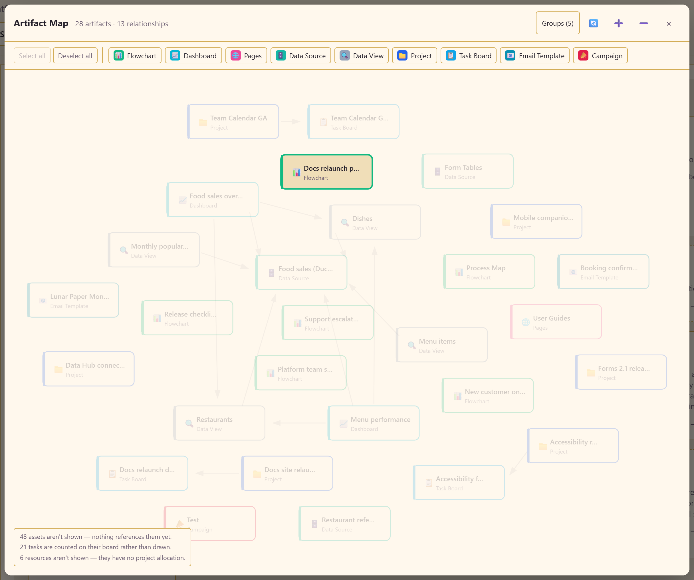
Open it with Artifact Map in the service’s top row.
Artifact types
Section titled “Artifact types”Nine types are drawn, each with its own colour and filter button.
| Type | Produced by | Typically connects to |
|---|---|---|
| Data Source | Data Hub | Data views built on it |
| Data View | Data Hub | The data source below it, dashboards above it |
| Dashboard | Dashboards | The data views and datasets its widgets bind to |
| Flowchart | Charts | Scenarios derived from it |
| Pages | Pages | The content it publishes |
| Project | Projects | Task boards linked to it |
| Task Board | Task Boards | The project that links it |
| Email Template | Emails | Campaigns that use it |
| Campaign | Marketing | The email template it sends |
Reading the map
Section titled “Reading the map”The header gives the totals — in the example, 28 artifacts and 13 relationships. Arrows run from a thing to the thing it depends on.
The clusters tell you where the service’s centre of gravity is. In this one, a DuckDB data source sits underneath four data views, which in turn feed two dashboards — so that single connection is load-bearing for six other artifacts.
Filter to one chain
Section titled “Filter to one chain”The type buttons show and hide each type, with Select all and Deselect all. The counts in the header update with the filter.
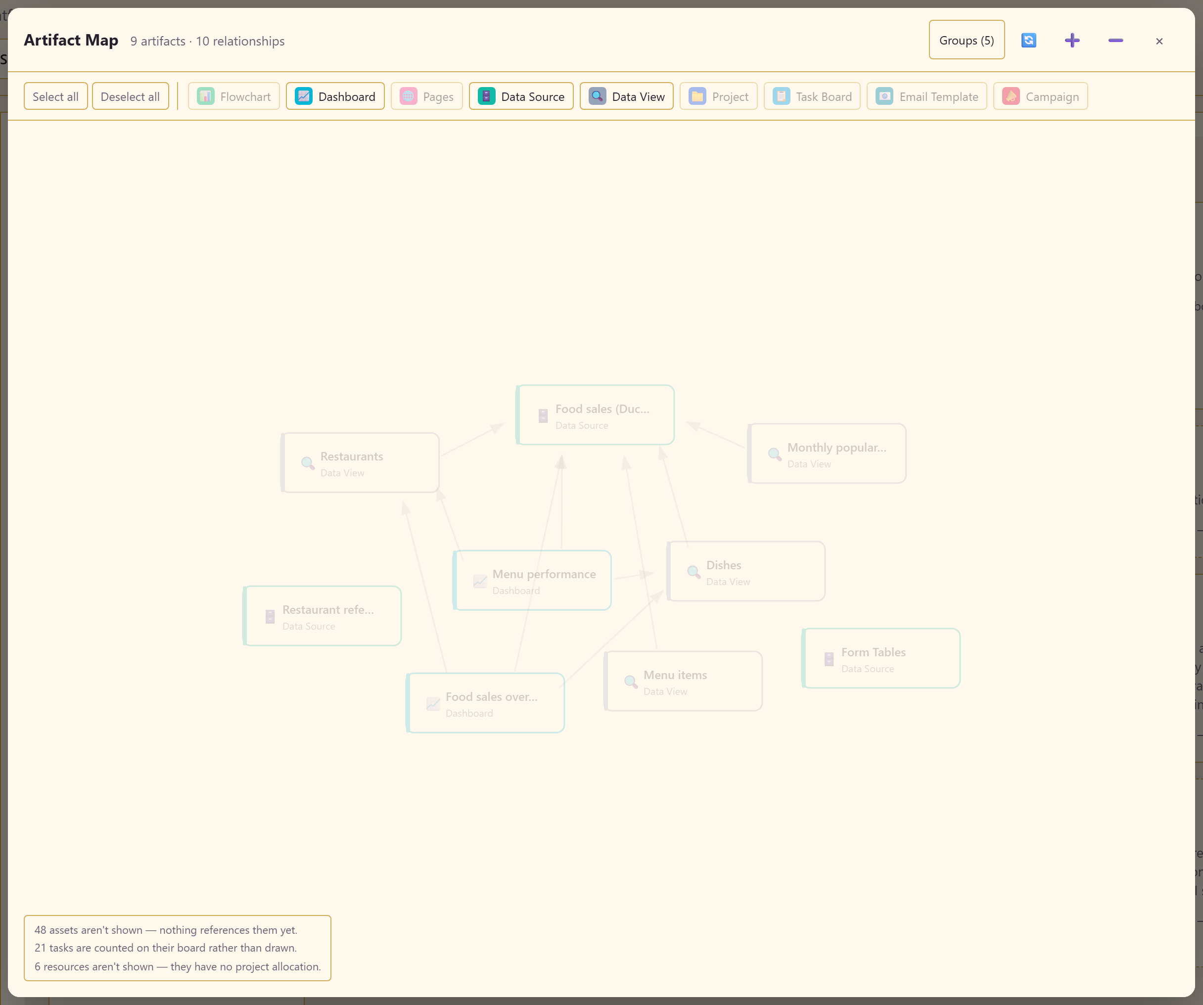
Filtering to Data Source, Data View, and Dashboard isolates the data chain: 9 artifacts and 10 relationships, with everything else stripped away.
This is the map’s most useful trick. A full map of a busy service is a hairball; three types at a time is a diagram you can actually read. Start narrow and add types.
Groups
Section titled “Groups”Groups collapses the map, gathering artifacts by type rather than drawing each one.
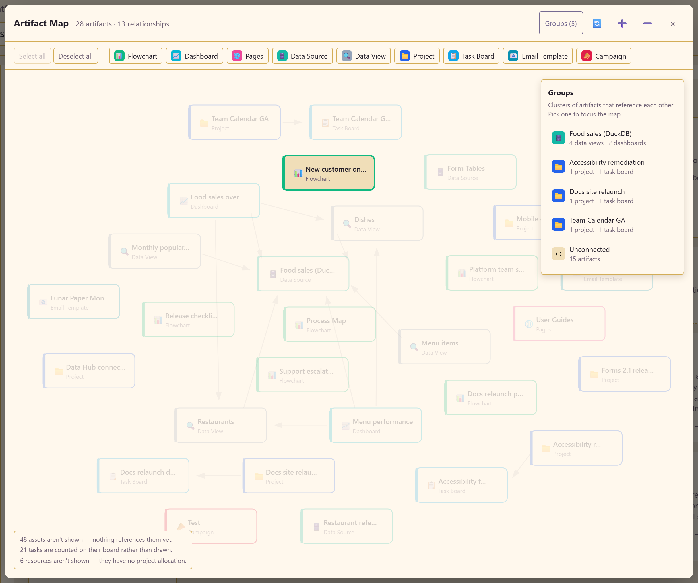
Use it on a large service where the individual names matter less than the shape.
Moving around
Section titled “Moving around”A refresh control, zoom in, zoom out, and a close button sit in the header. On a large map, zoom out first to find the cluster you want, then zoom into it.
What the map leaves out
Section titled “What the map leaves out”The panel in the corner states exactly what is not drawn, and it is worth reading rather than skipping:
Assets nothing references yet. In the example, 48 of them. These exist in the Asset Library but have no relationship to draw.
Tasks counted on their board. 21 in the example. Drawing every task individually would bury the structure, so the board stands for them.
Resources with no project allocation. 6 in the example. A resource only appears once it is allocated.
None of these is an error. They are the map keeping itself readable, and each number tells you something true about the service.
What to use it for
Section titled “What to use it for”Understanding an inherited service. Ten minutes here beats an hour clicking through modules.
Impact before deleting. Before removing a data view, look at what points at it. The dashboards that will break are drawn right there.
Finding orphans. The exclusion note gives you the count of unreferenced assets. A large number means content built and abandoned, or work never wired up.
Explaining the service. It answers “what does this team actually have?” better than any list of module names.
What it is not
Section titled “What it is not”Not a process diagram. It shows dependency between artifacts, not the order work happens in. For that, map the process in Charts.
Not live monitoring. A line means a relationship exists, not that the thing at the end of it is healthy. A drawn data source can still be offline.
Not a permission view. It shows structure, not who can see what. Control what gets published covers who can reach an item.
Related
Section titled “Related”Artifacts and assets explains why the map and the library report different counts. See how everything connects is the task-shaped version of this page.