
Builder and settings reference
Builder regions
Section titled “Builder regions”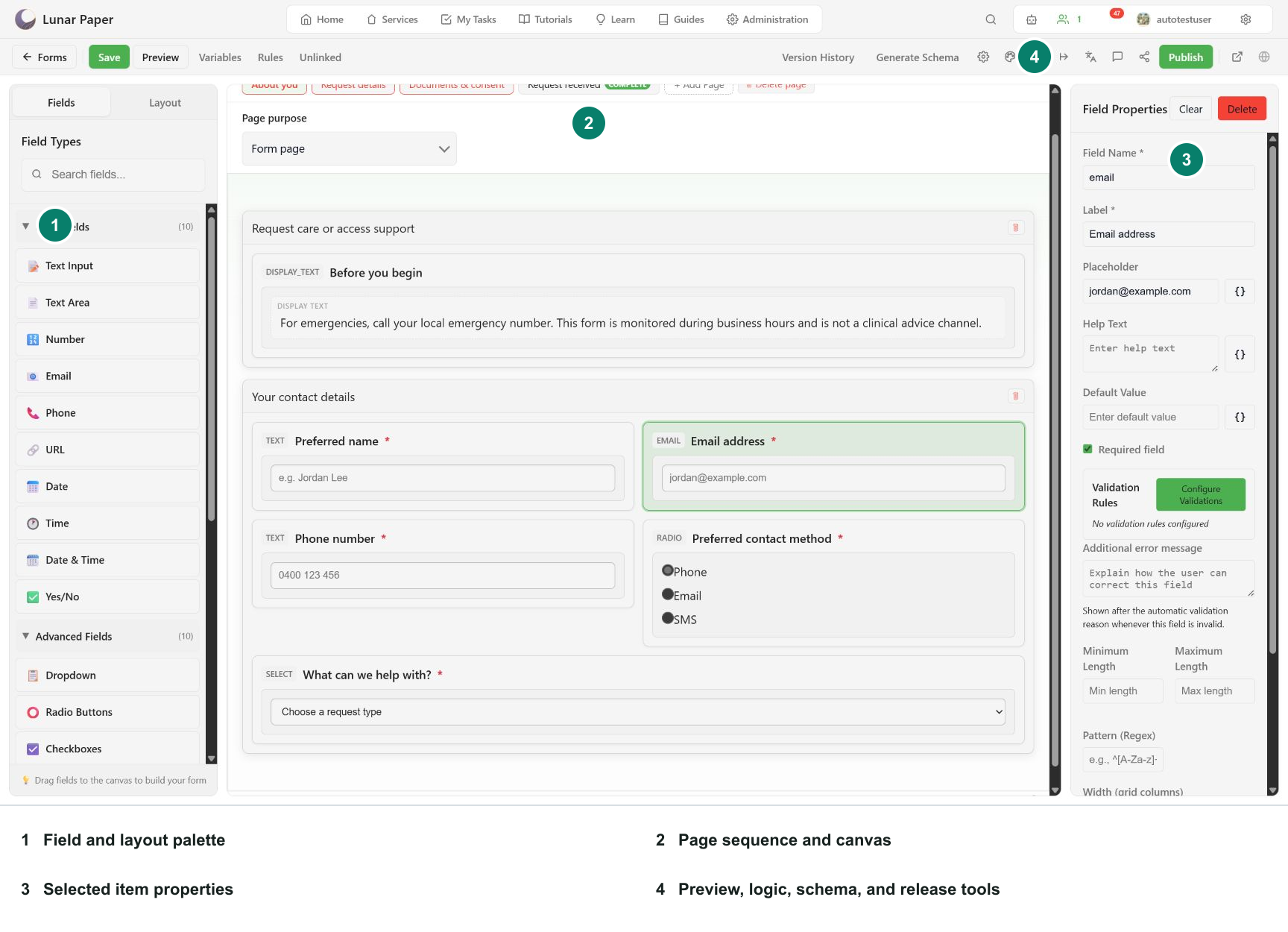
- The left palette adds fields and layout containers.
- The center page strip and canvas show document structure.
- The right panel edits the selected item.
- The toolbar opens Preview, Variables, Rules, Unlinked columns, versions, schema, settings, translations, comments, access, and publishing.
Page operations
Section titled “Page operations”| Control | Result |
|---|---|
| + Add Page | Creates a respondent page. |
Double-click or F2 |
Starts inline rename on the page tab. |
Enter or blur |
Saves the trimmed title. |
Escape |
Cancels the rename. |
| Delete page | Removes the selected page and its children from the draft. |
| Page purpose | Distinguishes a normal form page from the submission-complete page. |
Normal pages appear in the respondent step sequence. The submission-complete page is excluded from steps and from storage, and appears only after a successful submission.
Global header and footer zones carry shared display content. They can be collapsed in the editor without being hidden from preview or published forms.
Save status
Section titled “Save status”The builder identifies unsaved changes and records a new current version after save. Use Save or Ctrl+Enter before a risky structural edit and before publishing.
Toolbar
Section titled “Toolbar”| Control | Purpose |
|---|---|
| Forms | Return to the service form catalogue. |
| Save | Persist the draft as the current version. |
| Preview / Hide Preview | Toggle the shared-renderer test surface. |
| Variables | Search and edit form variables. |
| Rules | Search and filter conditional rules. |
| Unlinked | Review stored columns without active fields. |
| Version History | Inspect, revert, or delete checkpoints. |
| Generate Schema | Inspect JSON and generate or repair storage. |
| AI Assistant | Form-aware chat, quick actions, and proposal review. |
| Form settings | Name, description, table name, engine, regional defaults, editor zones, language switcher, draft save and resume. |
| Design | Page sequence position, navigation style, Back and Next placement, navigation behaviour, validation skip, theme, Brand version. |
| Publishing settings | Internal publishing, external publisher, access shortcut. |
| Submission actions | Ordered post-storage actions. |
| Translations | Language sets and translated respondent copy. |
| Comments | Resource-scoped review discussion. |
| Internal access | Authenticated audience. |
| Publish | Release a saved version to selected publisher locations. |
Design settings
Section titled “Design settings”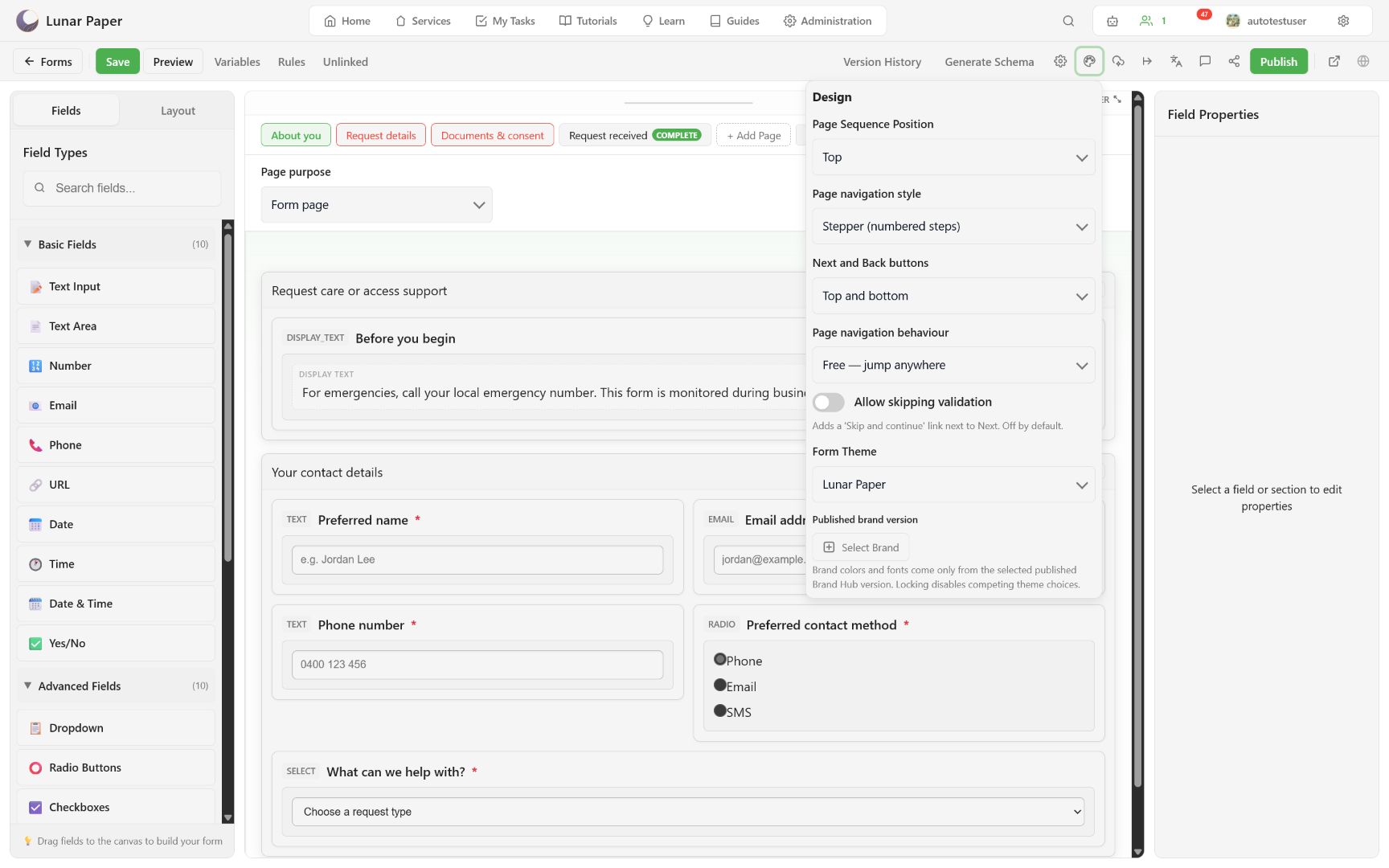
| Setting | Values | Default | Notes |
|---|---|---|---|
| Page Sequence Position | top, bottom, left, right |
top |
On narrow screens left renders above the form and right below it, both as a horizontal bar. |
| Page navigation style | tabs, stepper, progress-bar |
tabs for new schemas |
All three keep Back and Next; tabs additionally makes every page clickable. |
| Next and Back buttons | bottom, top-and-bottom |
bottom |
top-and-bottom requires engine 1.1.0 or later. |
| Page navigation behaviour | free, gated, strict-linear |
free |
Hidden in the popover while the style is tabs. |
| Allow skipping validation | on, off | off | Adds a Skip and continue link beside Next. Hidden while the style is tabs. Page-level only. |
| Form Theme | Any installed theme slug | lunar-paper |
Disabled while a published Brand version is locked. |
| Published brand version | Brand kit, version, lock | none | Shown when Brand Hub branding is enabled. |
To choose between these settings rather than look them up, see Design the form.
Theme catalogue
Section titled “Theme catalogue”Thirty-one themes ship built in. New forms start on Lunar Paper. Themes apply to respondent output only; builder chrome always uses platform UI.
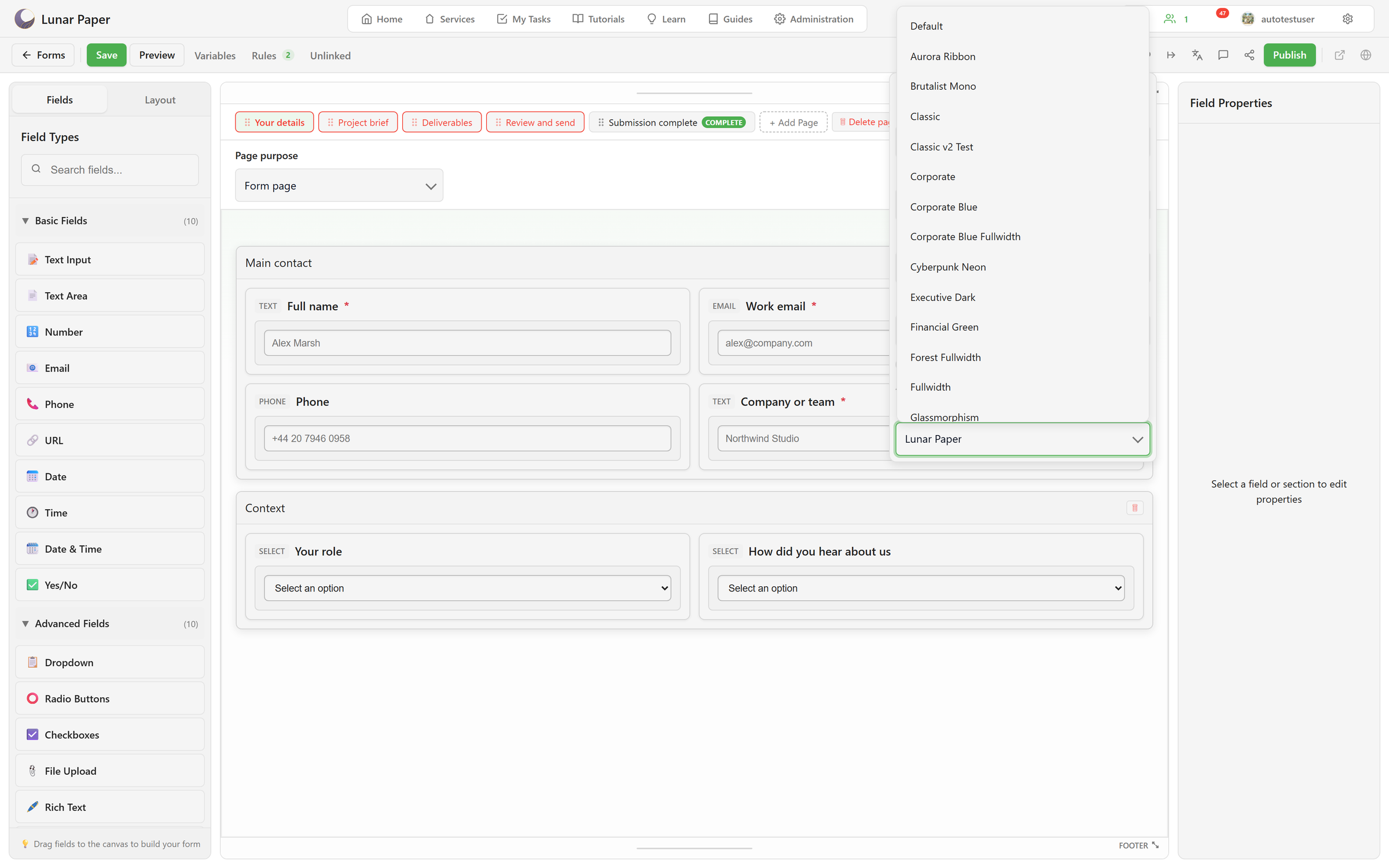
| Family | Themes |
|---|---|
| Brand | Lunar Paper (default), Lunar Paper Dark, Lunar Paper Sepia |
| Starters | Classic, Minimal, Modern, Red, Corporate Blue |
| Industry | Executive Dark, Financial Green, Legal Serif, Sales Contract, Healthcare Clean |
| Distinctive | Glassmorphism, Neondark, Professional |
| Fullwidth | Corporate Blue Fullwidth, Forest Fullwidth, Midnight Fullwidth, Minimal Fullwidth, Ocean Fullwidth, Rose Fullwidth, Sunset Fullwidth, Fullwidth |
| Expressive | Terminal Boot, Aurora Ribbon, Tactile Clay, Cyberpunk Neon, Brutalist Mono, Y2K Bubblegum |
Administrators add and edit themes in Administration → Themes → Form themes. The token editor covers the screen, form surface, header and footer, sections, labels, each field type, primary and secondary buttons, page tabs, stepper, progress bar, draft controls, error text, submission status, and the completion page. It also has a custom CSS panel and a compiled-CSS view. Custom themes appear in the form’s theme list beside the built-ins.
A selected published Brand Hub version supplies approved colors and fonts and disables competing theme choices.
Engine
Section titled “Engine”| Engine | Status | Adds |
|---|---|---|
| 1.0.0 | Legacy | Base rendering for compatible saved forms. |
| 1.0.1 | Legacy | Regional and temporal behavior. |
| 1.1.0 | Legacy | Ordered post-submission actions, submission-complete page, top-and-bottom navigation controls, reversible value rules. |
| 1.2.0 | Stable, default for new forms | Respondent draft save and resume. |
An engine downgrade is blocked while the form uses a feature the older engine cannot render: a completion page, post-submission actions, or draft saving. Rendering and form engines explains why a pin behaves this way.
Draft save and resume
Section titled “Draft save and resume”These settings live in Form settings, require engine 1.2.0, and are off by default: retention days, parallel drafts and picker, autosave, draft label field, and downloadable copies. Each setting and its trade-off is covered in Let respondents save and return later.
Publishing state
Section titled “Publishing state”Before first release, the toolbar shows Not published yet. After an Internal publish, it shows View Published Form. External publisher status appears separately. See Publish, submit, and recover for the release procedure.