
Logos
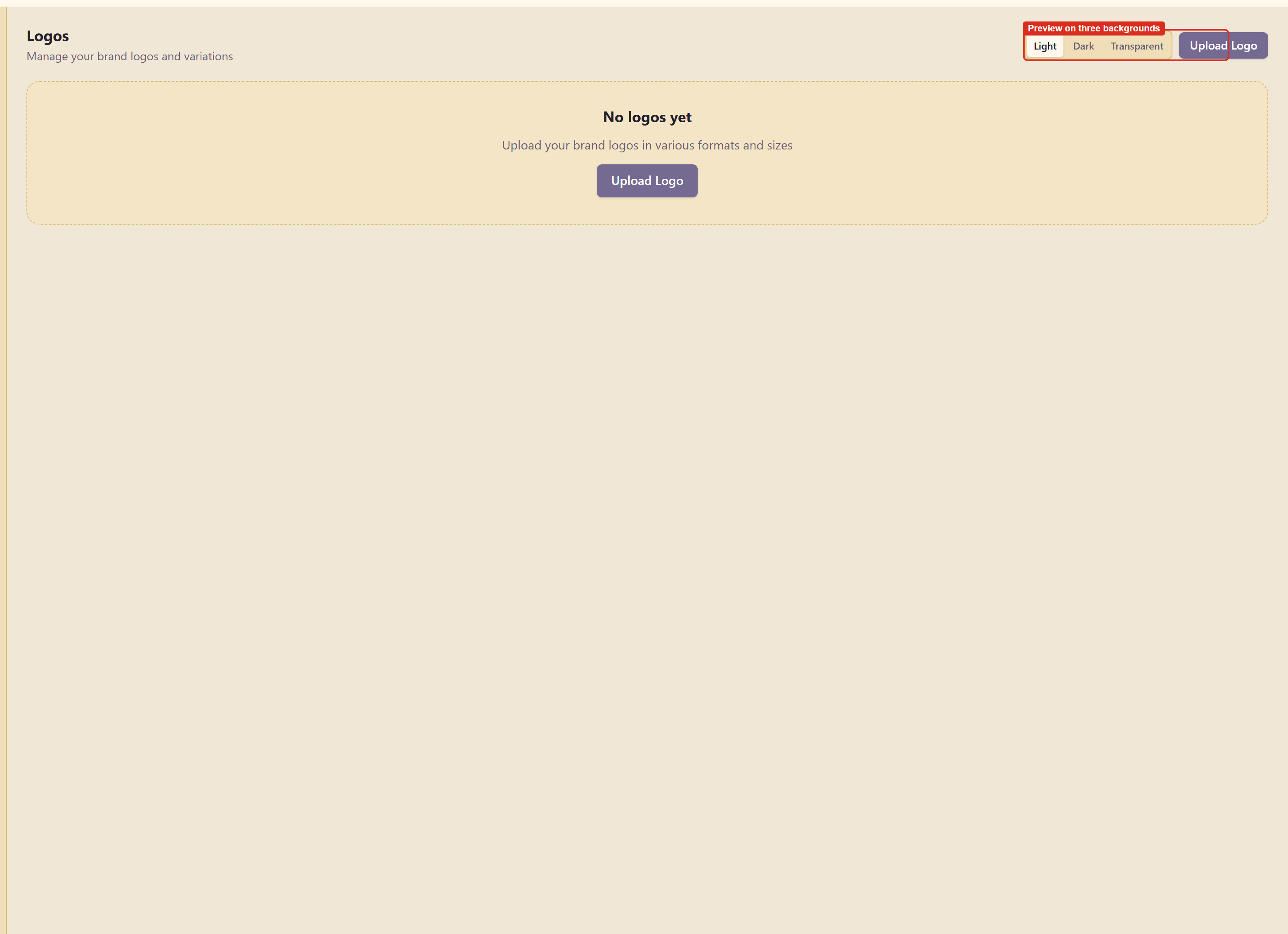
Logos holds the brand’s marks and previews each one on three backgrounds.
Upload and check
Section titled “Upload and check”Upload Logo adds a file. Light, Dark, and Transparent switch the background behind every mark.
Check all three before you call a logo finished. The failure this catches is common and embarrassing: a mark drawn in navy on white that vanishes on a dark header, or a JPEG with a white box around it that only shows up against colour.
Variations
Section titled “Variations”A brand normally needs more than one mark: a full lockup, a compact version, and a symbol on its own for small spaces.
Upload them as separate logos rather than trying to make one file work everywhere. A lockup scaled down to a favicon is unreadable, and a symbol stretched across a letterhead looks lost.
Clear space
Section titled “Clear space”The rule about clear space belongs in Brand guidelines under Logo usage, not in a filename. Write the measurement down — a margin equal to the height of the mark is a common one — because it is the rule most often broken by people who mean well.
Related
Section titled “Related”Brand guidelines is where logo rules are written. Export and share sends the marks out with the rest of the brand.