
Layout reference
| Layout | Use | Stored relationship |
|---|---|---|
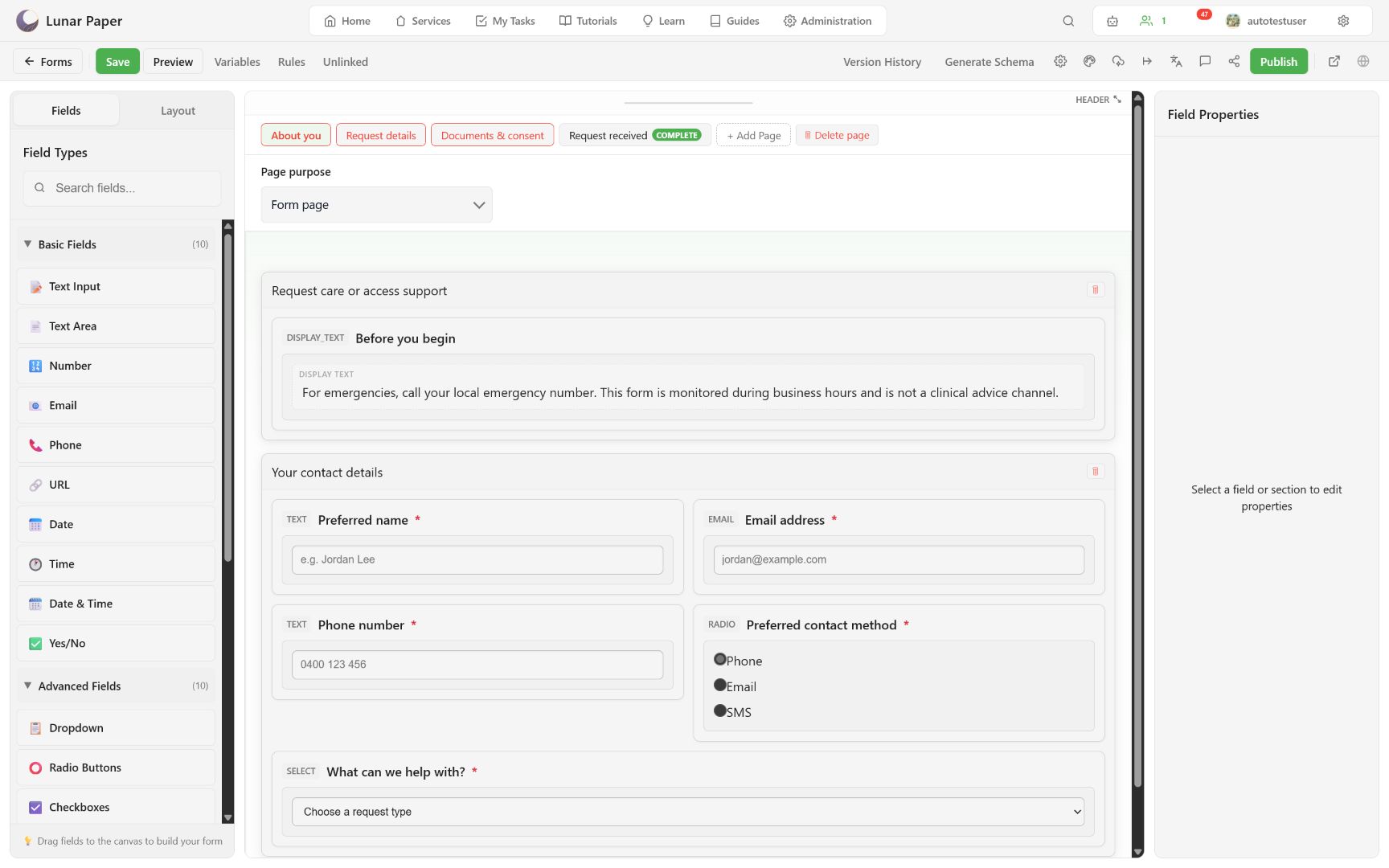
| Section | Main titled grouping and grid row | Contains fields in the parent response. |
| Repeater | Repeatable records | Creates related child rows. |
| Tabs | Parallel secondary groups | No independent answer value. |
| Accordion | Expandable groups | No independent answer value. |
| Well | Subtle contained area | No independent answer value. |
| Inset | Visually inset content | No independent answer value. |
| Card | Raised/grouped panel | No independent answer value. |
| Fieldset | Semantically related controls | No independent answer value. |
| Collapsible | Optional expandable region | No independent answer value. |
Layouts and fields use a 12-column grid. Common choices:
- 12: full width;
- 6: two equal columns;
- 4: three equal columns;
- 3: four compact columns.
Responsive rendering can stack columns at narrower widths. Always verify Tablet and Phone.
Sections and repeaters can define border style, color, width, radius, background, padding, shadow, and collapsible state. Use theme defaults unless a visual distinction communicates real structure.
Repeater configuration
Section titled “Repeater configuration”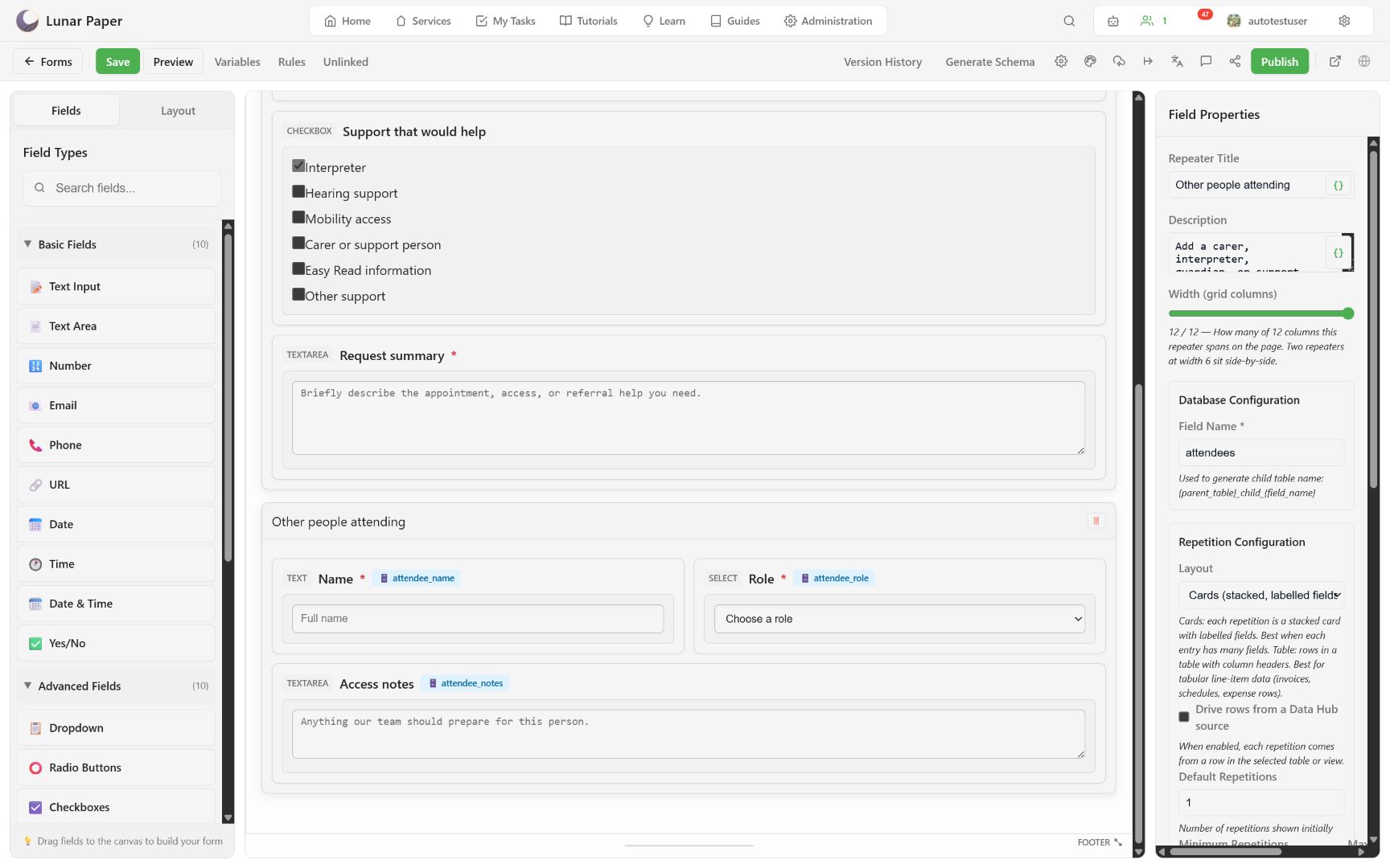
| Setting | Purpose |
|---|---|
| Field Name | Stable child-table suffix; part of the storage contract. |
| Layout | Cards for labelled stacked entries, Table for compact line items. |
| Data source | Optional Data Hub-driven rows. |
| Default repetitions | Rows present when the page first renders. |
| Minimum repetitions | Prevents removal below a threshold. |
| Maximum repetitions | Caps the Add action. |
| Add / Remove text | Custom button labels; name the record, such as “Add a person.” |
Nested fields each receive their own child-table column. The response viewer exposes repeater item counts separately from parent response fields.
To structure a form with these containers, follow Use layouts and repeaters. For how child tables are generated, see Form data model and storage.