
Themes and branding
A theme sets how a deck looks by default. It defines the colors, typography, spacing, corner radius, shadows, and transition speed.
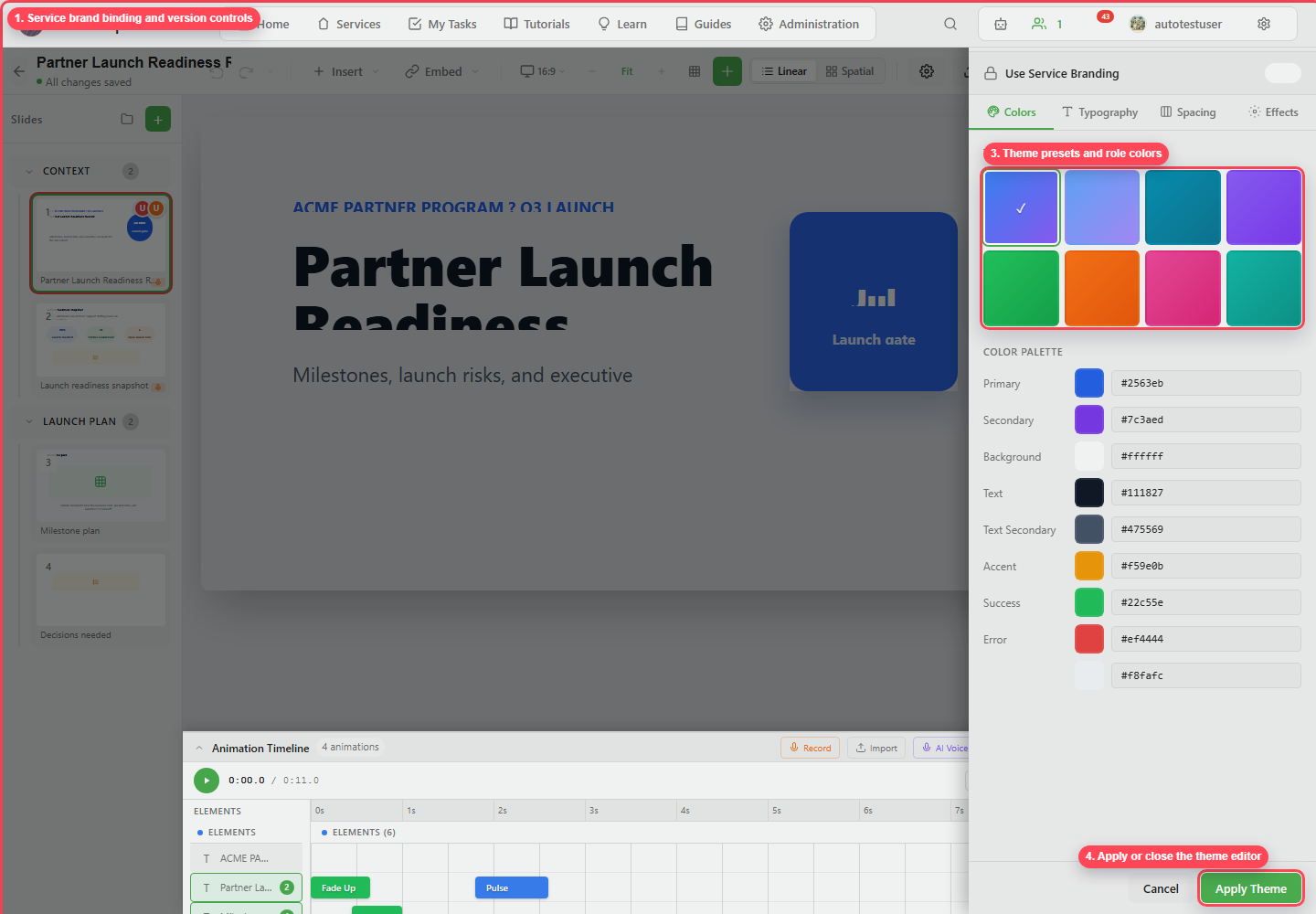
Service branding
Section titled “Service branding”Use Use Service Branding when the deck should inherit the service’s brand kit. When a brand has versions, choose the intended version and upgrade when the service brand changes.
Theme tabs
Section titled “Theme tabs”| Tab | Controls |
|---|---|
| Colors | Presets and role colors such as primary, secondary, background, text, accent, success, and error. |
| Typography | Heading, body, and code fonts plus type scale. |
| Spacing | Spacing scale and layout rhythm. |
| Effects | Border radius, shadows, and transition speed. |
Applying changes
Section titled “Applying changes”Theme changes preview against the current deck as you make them. Click Apply Theme to commit them to the presentation.