
Text
Text creates a text box wherever you click.
Activating it
Section titled “Activating it”Press T.
The rail highlights the active tool, and only one is active at a time.
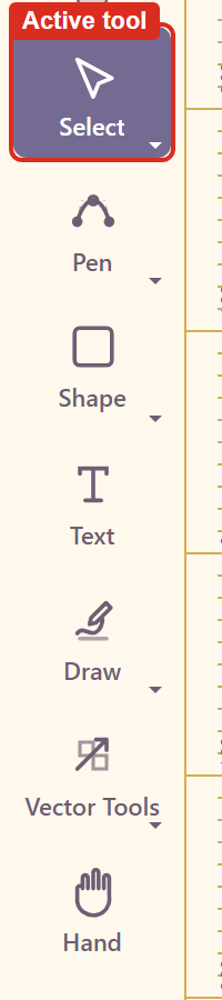
Note that clicking the tool button in the rail does not switch tools on the version tested — the highlight stays where it was. The keyboard shortcut is the reliable route. Troubleshooting has the detail.
Placing and editing
Section titled “Placing and editing”Click on the canvas and a text box appears carrying placeholder text. The canvas tells you what to do next: double-click to edit.
That two-step is easy to miss. Clicking once with the Text tool creates the box; it does not put you in the box. Typing straight after placing does nothing until you double-click into it.
Typing enters characters in reverse
Section titled “Typing enters characters in reverse”On the version tested, typing into a text element inserts each character before the last rather than after it, so the text comes out backwards.
Typing A, B, C, D — with a pause between each keystroke, so this is not a speed problem — produces DCBA.
Until it is fixed, paste text in rather than typing it, or type it backwards. Troubleshooting records the reproduction.
What you can change
Section titled “What you can change”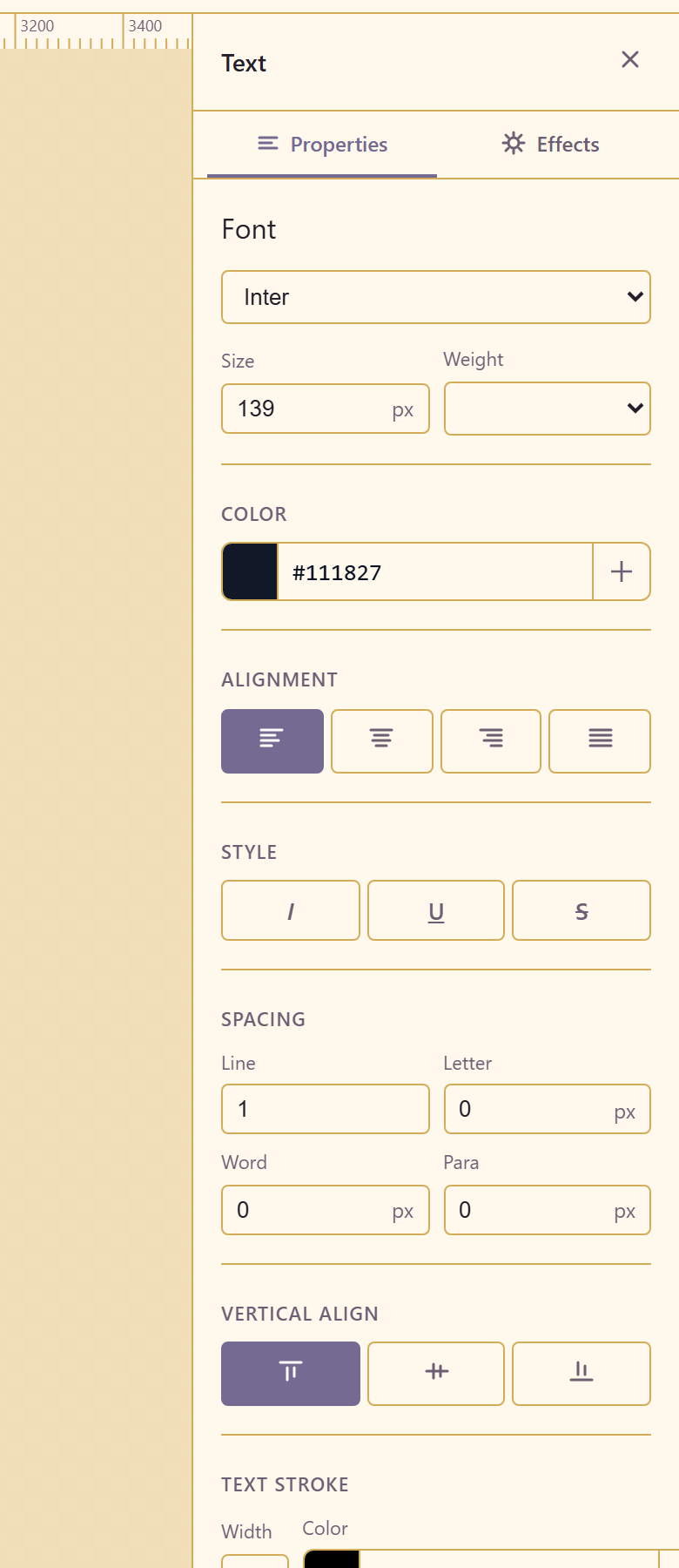
| Group | Controls |
|---|---|
| Font | Fifteen faces, from Inter and Roboto to Playfair Display and Merriweather |
| Size | In px |
| Weight | Light, Regular, Medium, Semi Bold, Bold, Extra Bold |
| Color | Field and picker |
| Alignment | Left, Center, Right, Justify |
| Style | Italic, Underline, Strikethrough |
| Spacing | Line, Letter, Word, Para |
| Vertical align | Top, Middle, Bottom |
| Text stroke | Width and colour |
| Case | Aa, AA, aa, Aa |
| Position and Size | X, Y, W, H |
Three controls people miss
Section titled “Three controls people miss”Text stroke outlines the letterforms. It is how white type stays legible over a photograph without resorting to a drop shadow.
Case transforms the display without changing what you typed, so a heading can be set in capitals and stay editable and searchable as written.
Para spacing is the gap between paragraphs. When a block looks cramped, this is the control to reach for — increasing line spacing instead loosens the whole block.
Related
Section titled “Related”Properties reference lists every control. Apply a brand covers using house fonts.