
Responsive layouts
Slideshow can preview a deck at desktop, tablet, and mobile sizes. Check those previews before you publish a deck that people will read outside presenter mode.
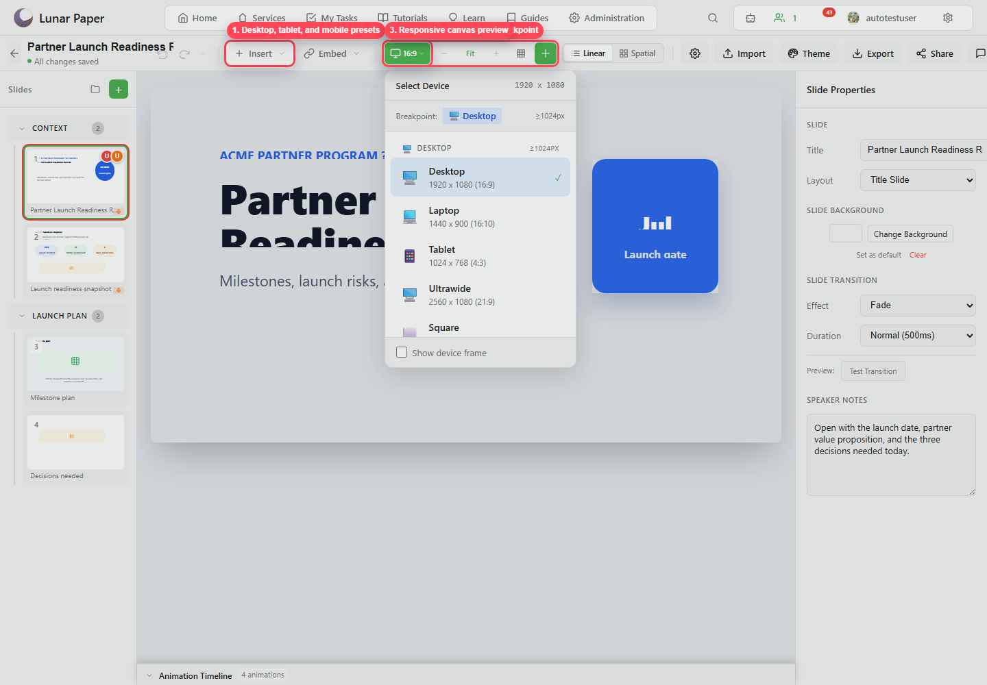
Preview modes
Section titled “Preview modes”The device control shows the current deck ratio or preview preset. Use it to switch between normal deck editing and breakpoint previews.
Responsive overrides
Section titled “Responsive overrides”Element position settings can include tablet and mobile overrides. Use them to hide an element, change grid column/span, adjust vertical position and height, or tune text size for smaller screens.
When to use responsive overrides
Section titled “When to use responsive overrides”Use overrides when the deck is exported or shared as an interactive web page, embedded in another workspace, or opened on phones and tablets. When you are presenting live instead, get the deck’s main aspect ratio right first.