
Field type reference
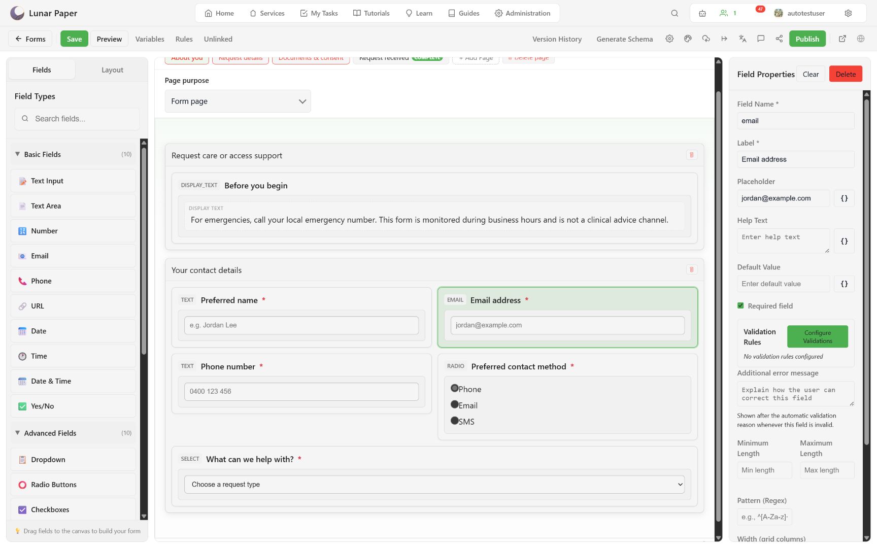
Twenty-three palette entries are available: ten basic fields, ten advanced fields, and three display items. Basic and advanced fields store a respondent answer; display items do not.
Basic fields
Section titled “Basic fields”| Palette label | Value | Guidance |
|---|---|---|
| Text Input | Text | Short single-line answer. |
| Text Area | Text | Longer plain-text answer. |
| Number | Number | Numeric value; add range validation where required. |
| Text | Use the Email validation preset. | |
| Phone | Text | Preserve formatting and country context; do not treat as arithmetic. |
| URL | Text | Use the URL validation preset. |
| Date | Date | Calendar date without an implied time. |
| Time | Time | Time-of-day interpreted through regional policy. |
| Date & Time | Date-time | Instant/local date-time according to field and regional policy. |
| Yes/No | Boolean | Binary acknowledgement or choice. |
Advanced fields
Section titled “Advanced fields”| Palette label | Value | Guidance |
|---|---|---|
| Dropdown | One option | Compact single selection. |
| Radio Buttons | One option | Visible mutually exclusive choices. |
| Checkboxes | Multiple options | Zero or more selected values. |
| File Upload | Guarded file reference | Ask only for necessary files. |
| Rich Text | Sanitized rich text | Formatting, links, tables, and guarded images. |
| Signature Pad | Guarded signature reference | Supports drawn and typed keyboard input. |
| Address Autocomplete | Address selection | Availability depends on configured address service. |
| Date Range | Start and end dates | Validate ordering and regional display. |
| Rating | Numeric/selected rating | Button-based selected state. |
| Color Picker | Color value | Uses the shared color picker and dismissible overlay. |
Display items
Section titled “Display items”| Palette label | Storage | Guidance |
|---|---|---|
| Display Text | None | Plain instructions or emphasis. |
| Display HTML | None | Sanitized formatted content. |
| Display Image | None | Informational image with appropriate accessible text. |
Field properties
Section titled “Field properties”Every response field exposes the same property set in the right panel:
| Property | Purpose |
|---|---|
| Label | Respondent-visible text, also used by accessibility tools. |
| Field Name | Storage column identity. Keep it stable after responses exist. |
| Placeholder | An example answer. Never a replacement for a label. |
| Help Text | Explains the expected answer. |
| Default Value | Pre-populates a response where appropriate. |
| Required | Blocks page navigation and submission until answered. |
| Validation Rules | Reusable rules, including the Email, Phone, and URL presets. |
| Minimum / Maximum Length | Character bounds on text values. |
| Pattern | A regular-expression constraint. |
| Additional error message | Corrective guidance shown with a failed rule. |
| Width | Placement on the 12-column form grid. |
| Conditional Rules | Condition-driven visible, enabled, required, or value behavior. |
Required, format, range, and custom guidance are enforced by the renderer in Preview and in published contexts alike.
Common authoring rules
Section titled “Common authoring rules”- Every response control needs a visible, specific label.
- Placeholder text is an example, not a replacement for a label.
- Keep Field Name stable after responses exist.
- Required state belongs in validation, not only in the label.
- Test each value in Preview and in one stored fictional response.
To add fields and design recoverable validation, follow Build fields and validation. For how field names become storage columns, see Form data model and storage.