
See how everything connects
A service accumulates connections nobody wrote down. A dashboard reads a data view, which reads a data source. A project links a task board. An email template gets used by a campaign. The artifact map draws all of it.
Open it
Section titled “Open it”Choose Artifact Map.
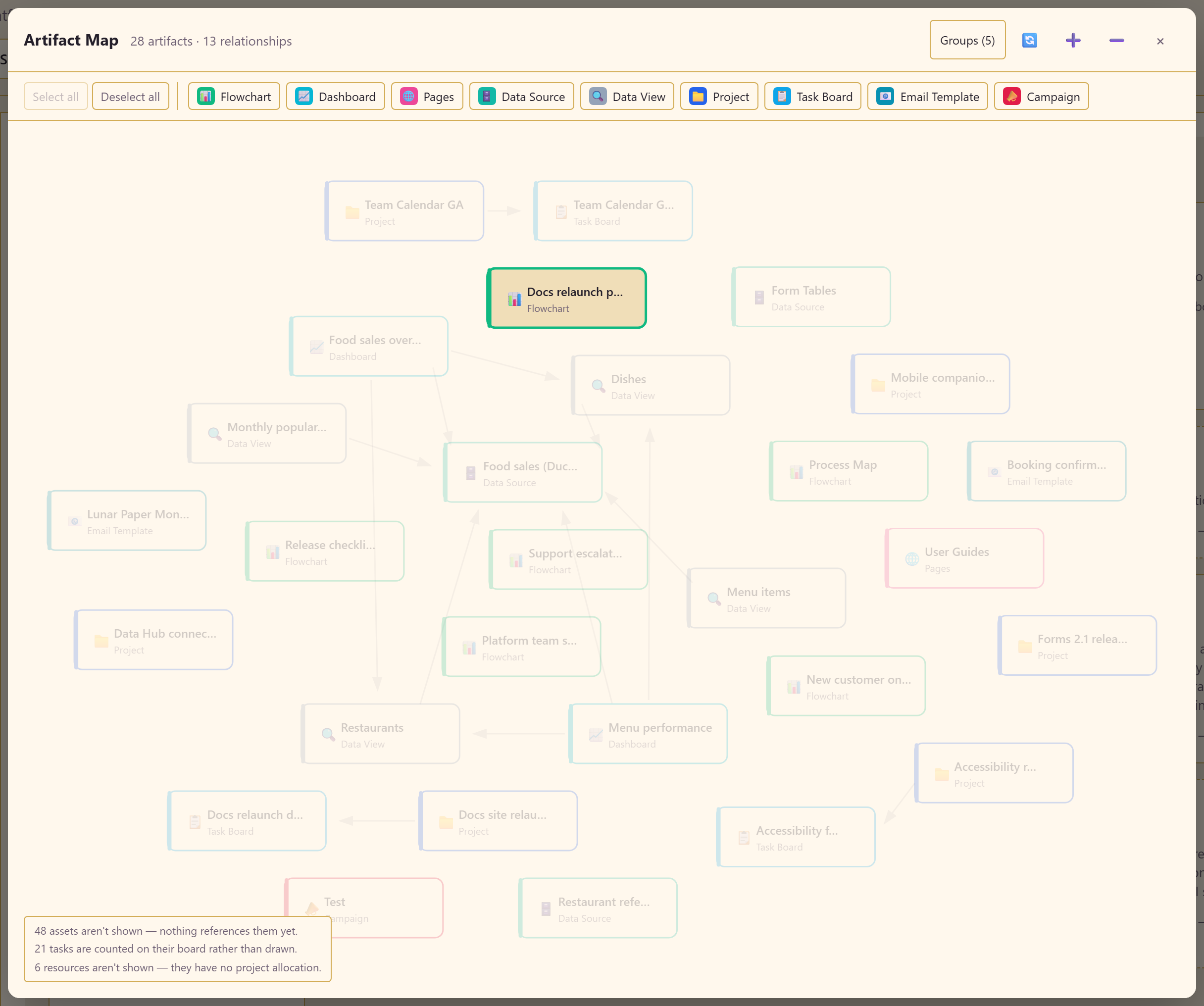
The header gives you the totals — in the example, 28 artifacts and 13 relationships.
What is on it
Section titled “What is on it”Every connected artifact, drawn by type: flowcharts, dashboards, pages, data sources, data views, projects, task boards, email templates, and campaigns. Arrows show which depends on which.
The type buttons along the top filter what is drawn, with Select all and Deselect all. Groups collapses the map. Zoom and reset controls move you around.
Read what it excludes
Section titled “Read what it excludes”The panel in the corner is the part people skip and should not. It states exactly what is not drawn — in the example: 48 assets not shown because nothing references them yet, 21 tasks counted on their board rather than drawn individually, and 6 resources not shown because they have no project allocation.
That honesty matters. An empty-looking map does not mean an empty service; it means nothing is connected yet. And a service with 28 artifacts on the map and 48 unreferenced assets is telling you something useful about how much of its content is actually wired into anything.
What to use it for
Section titled “What to use it for”Understanding a service you have inherited. Ten minutes here beats an hour of clicking through modules. You can see what the centre of gravity is — usually a data source or two with everything hanging off them.
Working out what breaks if you change something. Before deleting a data view, look at what points at it. The map shows the dashboards that will stop working.
Finding orphans. The exclusion note tells you how many assets nothing references. A large number is a sign of accumulated clutter, or of work that was never connected up.
Explaining the service to someone else. It is a far better answer to “what does this team actually have?” than a list of module names.
What it is not
Section titled “What it is not”It is not a process diagram. It shows dependency between artifacts, not the order work happens in. For that, map the process in Charts.
It is not live monitoring. It draws relationships, not health. A connection on the map does not mean the data source behind it is online.
Related
Section titled “Related”Data Hub explains the connection-to-dataset-to-view chain that produces most of the relationships you will see here.