
Charts
Charts draws diagrams — flowcharts, org charts, swimlanes, journey maps, network diagrams. That much you would expect.
What makes it worth learning is the second half. You can attach real information to each step of a process — who does it, how long it takes, how long it waits, its SLA, how risky it is — and the module then works out your lead time, your handoffs, your bottlenecks, and which steps are running past their SLA. A picture becomes something you can measure and improve.
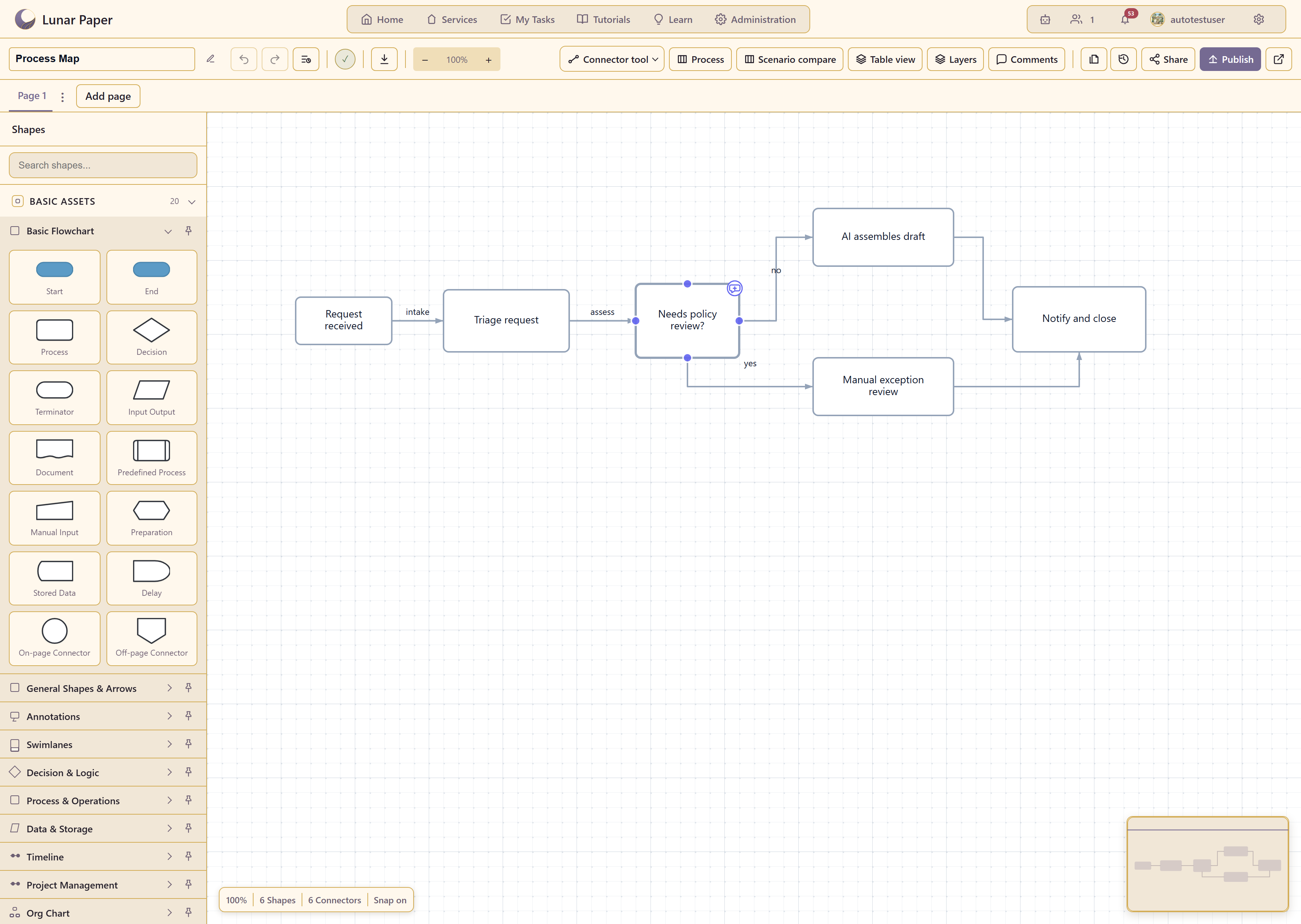
Where Charts lives
Section titled “Where Charts lives”Open a service and choose Charts under Content Modules.
The workspace lists your charts with counts for total, published, drafts, and needs review. A second tab holds 25 ready-made templates.
What you can do with it
Section titled “What you can do with it”Draw. 353 shapes across 21 categories, from basic flowchart boxes to UML, BPMN 2.0, network diagrams, UI wireframes, and circuit symbols.
Annotate. Give every step an owner, a duration, a wait time, an SLA, and a risk level. A step can be done by a person, an AI agent, or an automation.
Measure. The Process panel reports touch time, lead time along the longest path, how many times work changes hands, which steps miss their SLA, and where the bottlenecks are.
Compare. Pin the current process as a scenario, draft the improved version, and put them side by side.
Ask. The AI assistant is chart-aware inside the designer and can add shapes, draw connections, build swimlanes, and arrange the canvas for you.
Work together. Several people can edit the same chart at once and see who else is in it.
Publish. Share a read-only version with the service, with or without comments.
Export. PNG, SVG, and PDF for people; JSON, YAML, and Mermaid for machines.
Feature list covers all of it in one place.
The one thing to understand early
Section titled “The one thing to understand early”A chart and a process are the same object. Drawing boxes gives you a diagram; filling in the table behind it turns that diagram into a process you can analyse. Nothing forces you to do the second part, and plenty of useful charts never do.
But the analysis is the reason to choose this module over a drawing tool, and it only works if the steps are annotated. Charts and processes explains where the line sits.
Where to go
Section titled “Where to go”| If you want to | Go to |
|---|---|
| Build your first chart | Quickstart |
| See everything the module can do | Feature list |
| Follow a complete piece of work | Guides — nine end-to-end walkthroughs |
| Find which page covers a capability | Capabilities |
| Find a shape | Shape libraries |
| Pick a starting template | Template catalogue |
| Look up a control in the designer | Designer reference |
| Check who is allowed to do what | Permissions |
| Fix something that is not behaving | Troubleshooting |
The examples in these screenshots
Section titled “The examples in these screenshots”Captures use six charts built for this documentation. Process Map is a support intake process with six annotated steps, two routes, and a published version. Support escalation handoffs is a swimlane chart, Platform team structure an org chart, Docs relaunch plan a Gantt chart, New customer onboarding journey a journey map, and Release checklist an empty canvas.