
Design the form — theme, page bar, and navigation
Every choice below lives behind one button: Design in the builder toolbar. Each setting is small on its own, but respondents notice all of them. A four-page form with jumpable tabs works very differently from the same four pages behind a numbered stepper that will not let anyone move forward until the page validates.
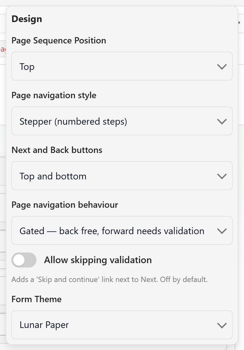
Nothing here changes what you collect, only what the form is like to fill in. Decide with a real respondent in mind: how long the form is, whether people fill it in once or every week, and whether they will be on a laptop or a phone.
Place the page bar
Section titled “Place the page bar”Page Sequence Position decides where the list of pages sits around the form: Top, Bottom, Left, or Right.
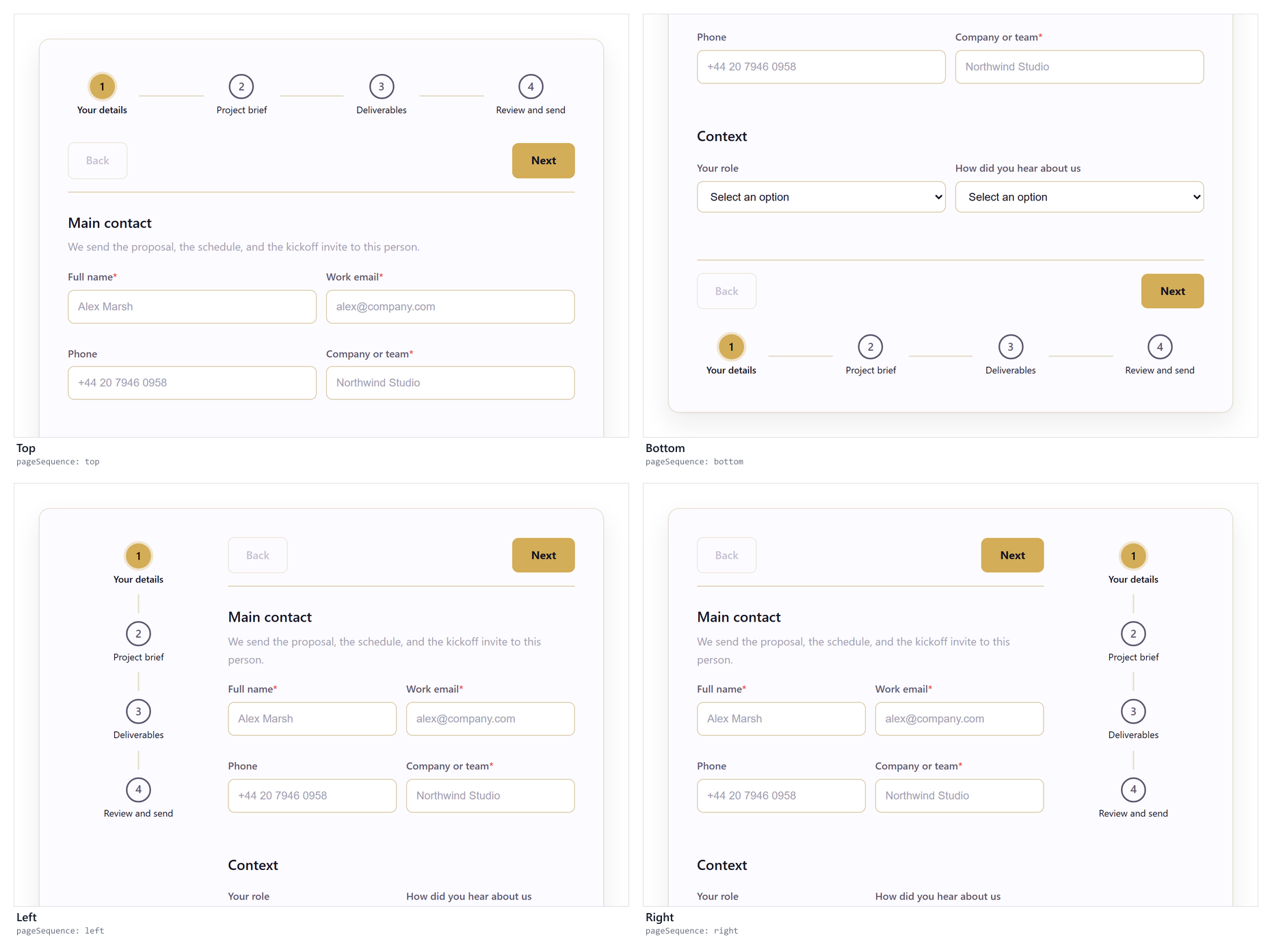
Top is the default, and it is the best choice for most forms of two to six pages: the respondent sees every page before answering the first question. Move it to Bottom when the first question should be the first thing on screen. That suits short forms and phone-first audiences, where space at the top of the screen matters.
The side positions keep the page list beside the content at all times, which helps on long or reference-heavy forms filled in on a wide screen. Choose Left by default and Right when the left edge already carries something else, such as service or site chrome around an embedded form.
On narrow screens the side positions fall back to a horizontal bar: a left bar sits above the form, a right bar below it. Long page titles can run past the edge of that bar at phone width, so preview at Phone before you settle on a side position. Shorten the page names if the titles overflow.
Choose how the page bar looks
Section titled “Choose how the page bar looks”Page navigation style changes both the appearance of the bar and what a respondent can do with it.
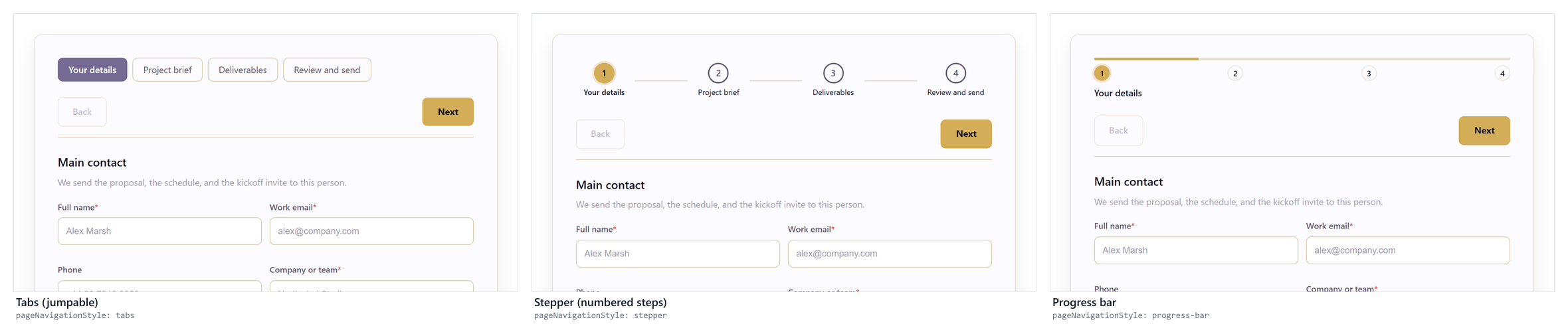
- Tabs (jumpable) makes every page a target. Respondents can answer in any order and move back and forth. Use it for forms people revisit, review, or fill in out of order.
- Stepper (numbered steps) shows a numbered sequence with a current step, which tells the respondent the form has a beginning and an end. Use it for intake, applications, and anything you want completed in one sitting.
- Progress bar shows a filling bar with the current page named underneath. Use it when a sense of progress matters more than the number of pages.
All three styles keep Back and Next. The difference is the page bar itself: tabs gives the respondent a set of targets to click, while a stepper or progress bar only reports where they are. Tabs is jumpable by definition, so the Design popover hides the behaviour settings below while tabs is selected. Switch to stepper or progress bar first if you want to control the order people move in.
Decide where Back and Next sit
Section titled “Decide where Back and Next sit”Next and Back buttons places the navigation controls at the Bottom only or at the Top and bottom.
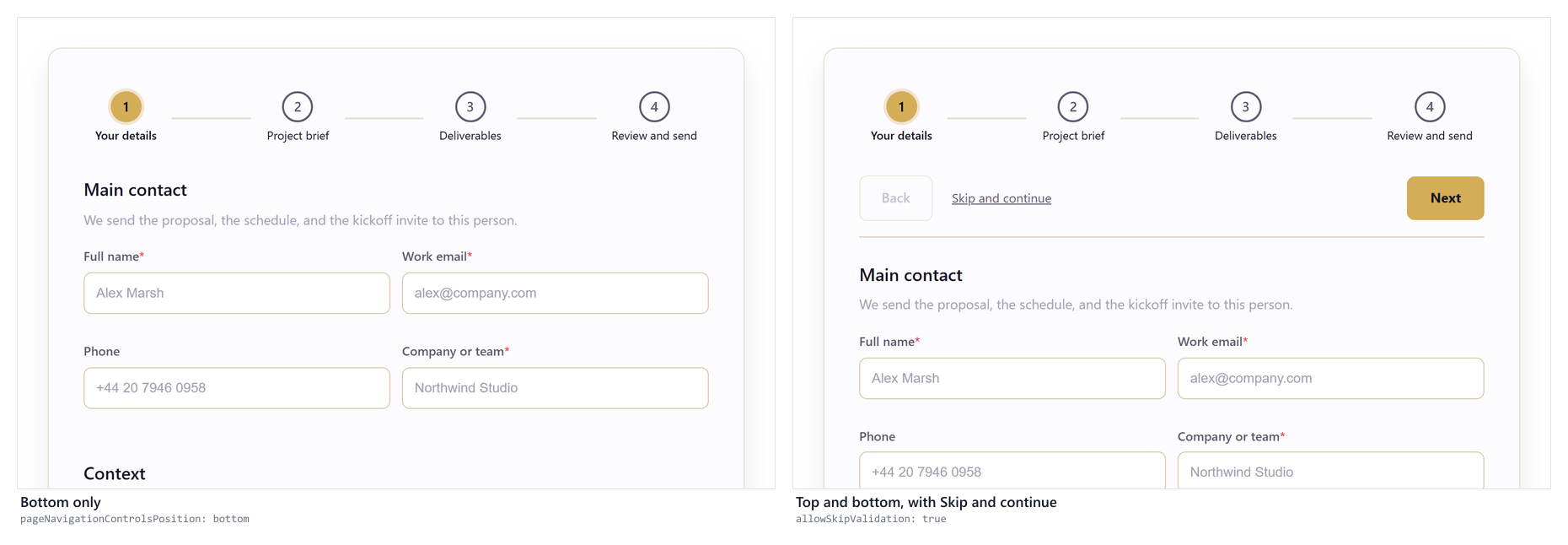
Bottom only is the conventional choice and keeps the page uncluttered. Top and bottom is worth it when a page is long enough to scroll: a respondent who has finished the visible questions should not have to scroll to find Next. This setting requires Forms engine 1.1.0 or later; on older pinned forms the control is disabled with a note explaining why.
Decide how strictly people move between pages
Section titled “Decide how strictly people move between pages”Page navigation behaviour applies to stepper and progress-bar forms:
- Free — jump anywhere keeps the bar clickable. Respondents fill pages in whatever order suits them.
- Gated — back free, forward needs validation lets a respondent go back at any time but not forward until the current page is valid. This is the kindest default for most intake forms, because it catches mistakes close to where they were made without stopping anyone from returning to an earlier page.
- Strict — only Next/Back turns the page bar into a progress indicator rather than a control. Use it when the order genuinely matters, for example when later questions depend on earlier answers.
With gated navigation, a blocked Next marks the incomplete fields and shows a count of problems against each page in the bar. The respondent can see which pages still need work.
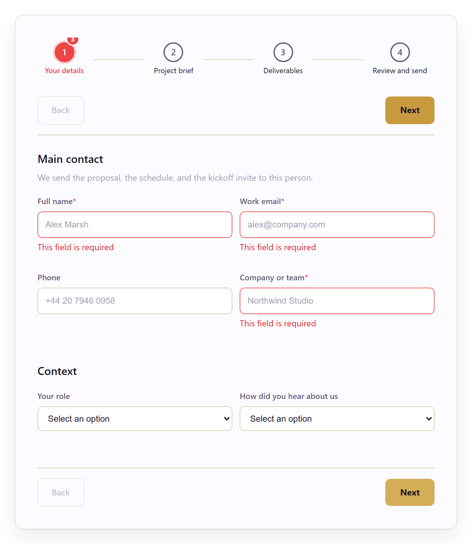
Allow skipping validation adds a Skip and continue link next to Next. It is off by default and should usually stay off. It is worth turning on for long internal forms, where someone needs to leave an unanswerable question and come back to it. Turning it on does not weaken submit-time validation; it only relaxes the page boundary.
Pick a theme
Section titled “Pick a theme”Form Theme sets the look of the respondent-facing form: page background, form surface, typography, inputs, buttons, the page bar, and the completion page. It has no effect on builder chrome, which always uses Lunar Paper platform UI.
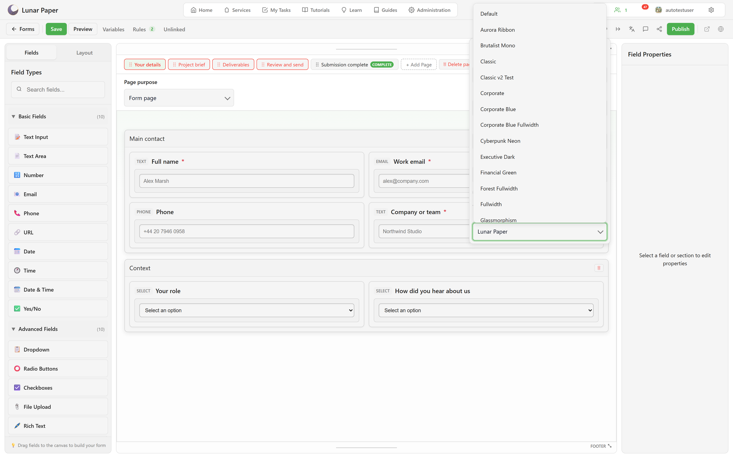
New forms start on Lunar Paper. The built-in themes are grouped into families, and the choice is mostly about tone. The theme catalogue lists every one by name.
Brand and starters
Section titled “Brand and starters”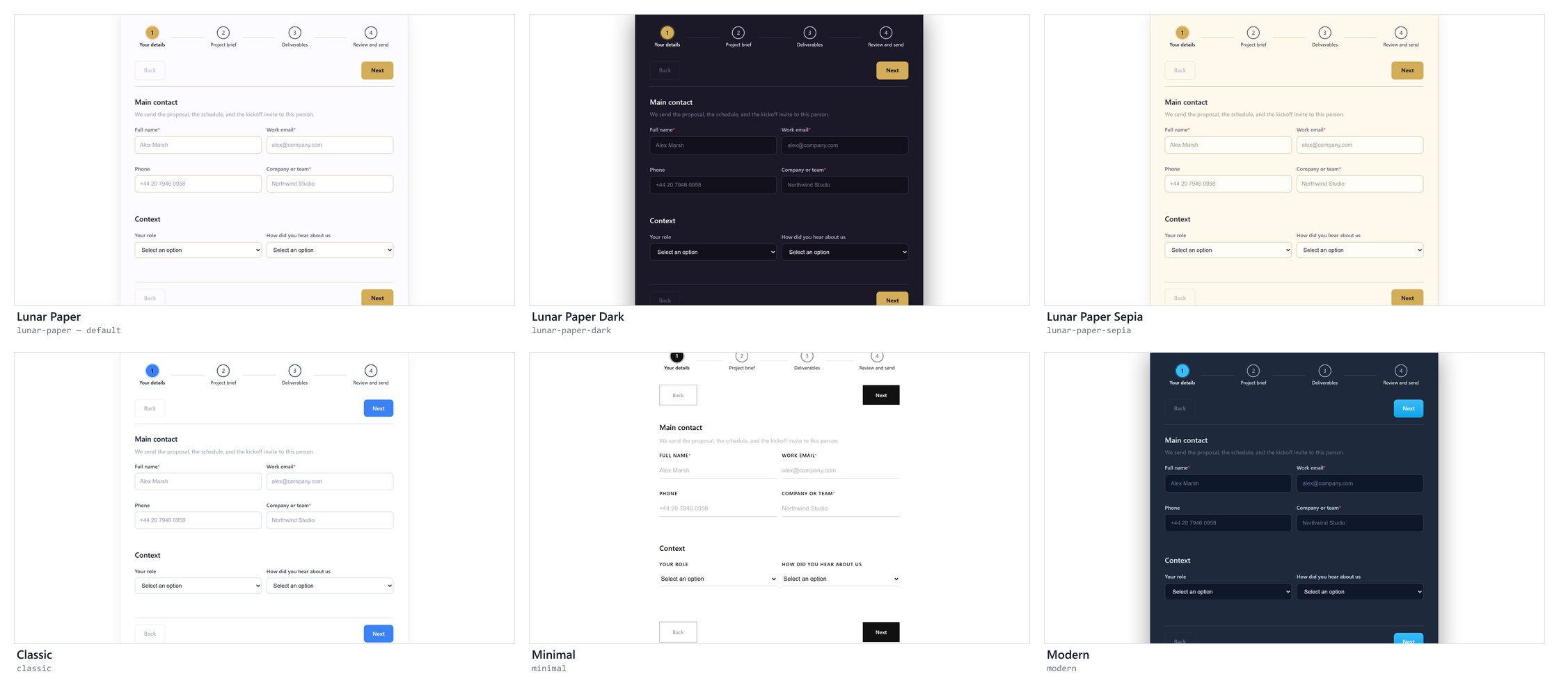
The three Lunar Paper themes match the app’s own light, dark, and sepia looks, which makes them the safest choice when a form sits inside the platform. Classic, Minimal, Modern, and Red are neutral starters when the form has no brand of its own.
Industry and distinctive
Section titled “Industry and distinctive”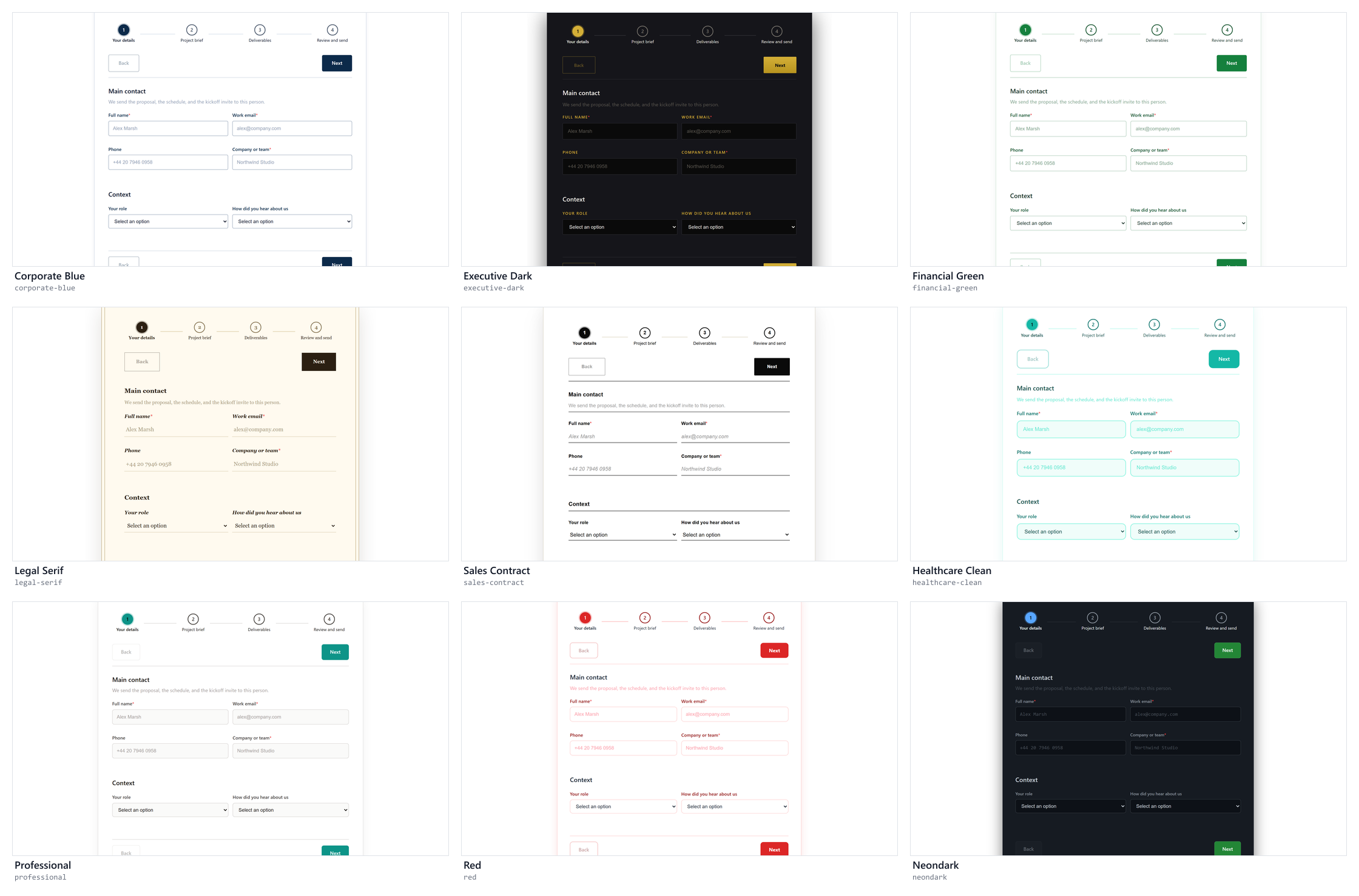
These carry a tone with them. Legal Serif and Sales Contract look like printed paper, which helps when someone is agreeing to something. Healthcare Clean is plain and generously spaced for patient-facing intake. Red is deliberately loud, so keep it for incidents and escalations, where urgency is the point.
Fullwidth
Section titled “Fullwidth”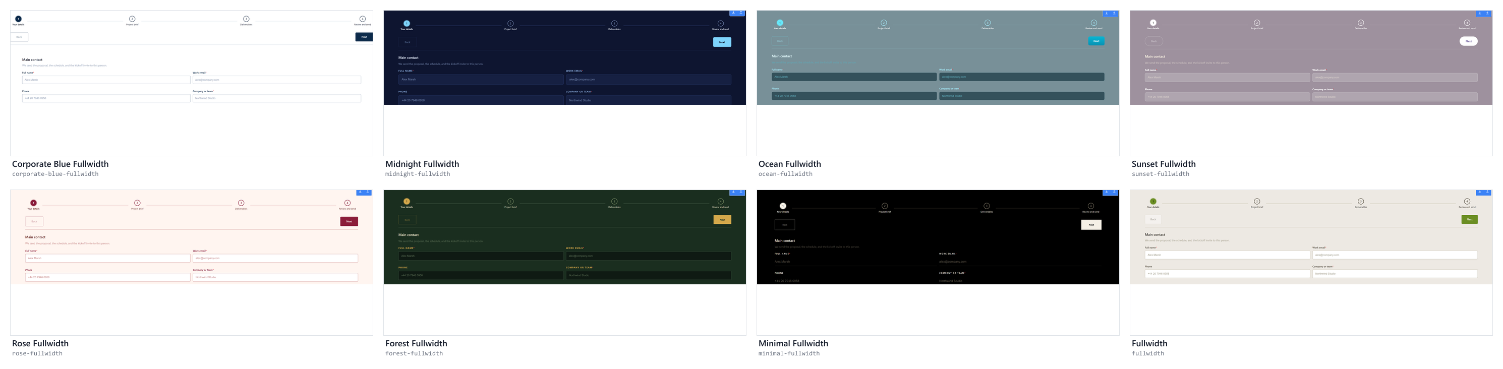
Fullwidth themes drop the centred card and run edge to edge. They suit forms that fill the whole page, such as a standalone published link or an embedded landing page, rather than a form shown inside other content.
Expressive
Section titled “Expressive”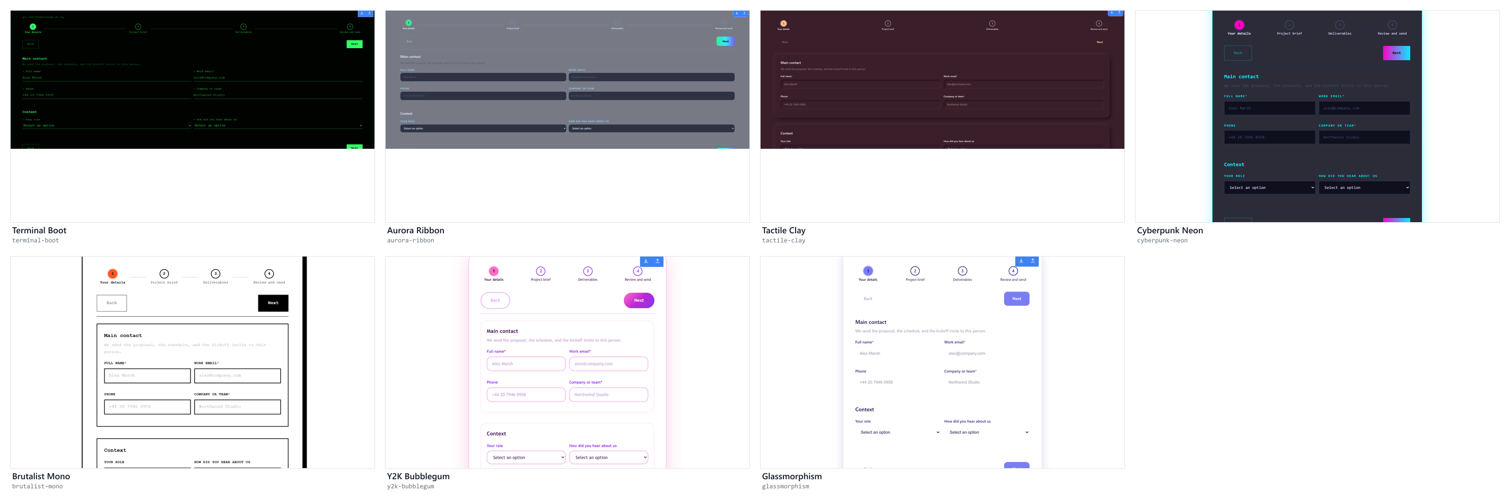
These are strong looks that suit few forms: a developer tool, a launch campaign, an internal form with a sense of humour. Check contrast and readability at phone width before publishing one of these to an audience that did not choose it.
Custom themes and Brand versions
Section titled “Custom themes and Brand versions”Administrators can create, duplicate, and edit themes in Administration → Themes → Form themes. The theme editor exposes tokens for every part of a form: screen, form surface, header and footer, sections, labels, each field type, primary and secondary buttons, page tabs, stepper, progress bar, draft controls, error text, and the completion page. It also has a custom CSS panel and a live preview. A custom theme appears in this list alongside the built-ins.
If your service uses Brand Hub, you can tie the form to a published brand version instead. A locked brand version supplies approved colors and fonts and disables competing theme choices, so one form cannot depart from the approved identity.
Check the result before you publish
Section titled “Check the result before you publish”- Open Preview and walk the form at Desktop, Tablet, and Phone.
- Confirm the page bar is readable in the chosen theme. Light text on a light background is the usual problem after a theme change.
- Try to move forward from an empty page and confirm the behaviour matches what you chose.
- Read one page aloud at phone width. If the page bar pushes the first question out of view, move it to the bottom or shorten the page titles.
- Save. Design settings are part of the form schema, so version history records them with everything else.
Related
Section titled “Related”- Configure settings and localization for metadata, engine, languages, and regional policy.
- Let respondents save and return later for long forms people cannot finish in one sitting.
- Builder and settings reference for every design value and its default.