
Design tokens
A design token is a brand value with a name that code can use. It is how the navy in your palette becomes --color-primary in a stylesheet rather than #0B1F33 typed out in forty places.
Adding a token
Section titled “Adding a token”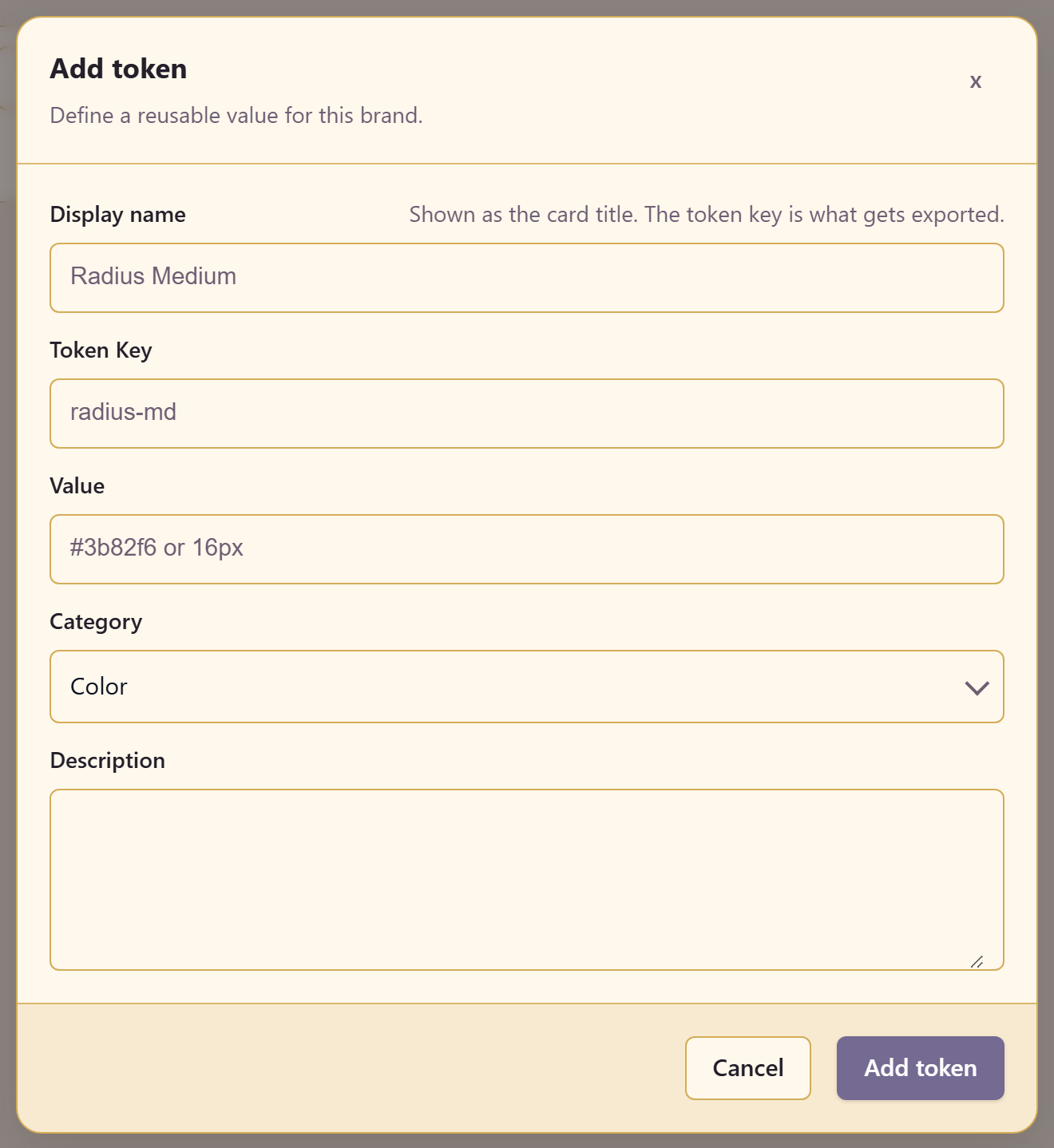
The dialog separates two names, and the distinction matters.
Display name is the card title — Radius Medium. Token Key is what gets exported — radius-md. The dialog says so directly.
Value takes whatever the token holds: #3b82f6, 16px, a shadow. Category files it, and Description records what it is for.
Categories
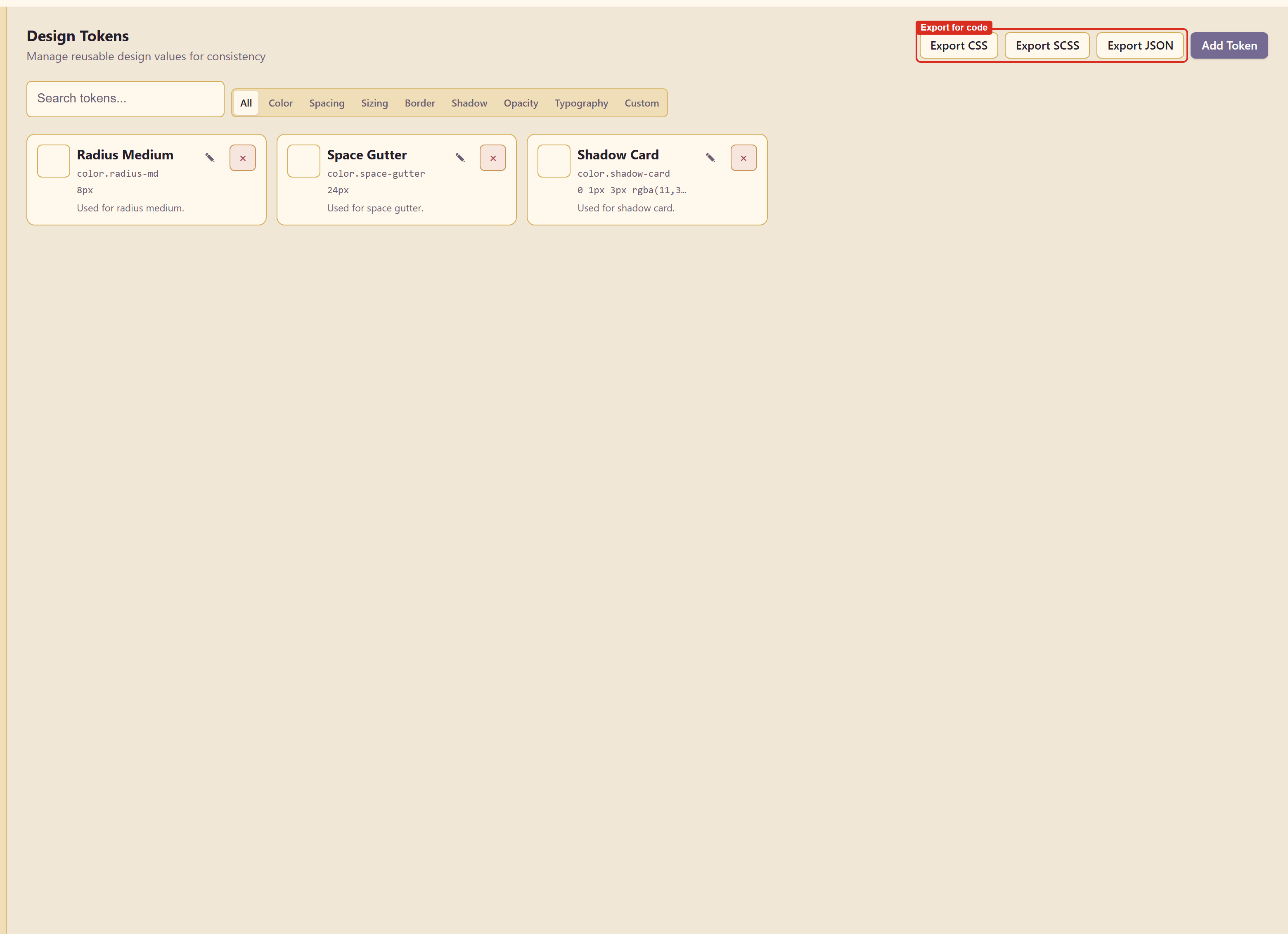
Section titled “Categories”Color, Spacing, Sizing, Border, Shadow, Opacity, Typography, and Custom, with an All view and a search box.
Categories are not decoration. A developer looking for the spacing scale should be able to filter to it without reading colour tokens, and that only works if things are filed correctly as they go in.
Naming
Section titled “Naming”Keys are the part that lasts, so name them for their role rather than their value.
--color-primary survives a rebrand. --color-teal does not — the day the brand changes to purple, either the name lies or every use site changes.
The same applies to sizes. radius-md survives a decision to soften every corner; radius-8 does not.
Exporting
Section titled “Exporting”Export CSS, Export SCSS, and Export JSON hand the whole set to developers.
CSS custom properties suit a site that consumes them at runtime. SCSS suits a build step. JSON suits a design-token pipeline that generates for several platforms at once.
Related
Section titled “Related”Colours and contrast is where colour tokens get their values. Export and share covers the other exports.