
Add and bind widgets
Building a widget takes two drags: one to place it, and one or more to give it data. The second is the part worth reading about, because dragging is the only way to create a binding and it is easy to get slightly wrong.
Place the widget
Section titled “Place the widget”The widget library sits on the left of the designer, grouped by kind.
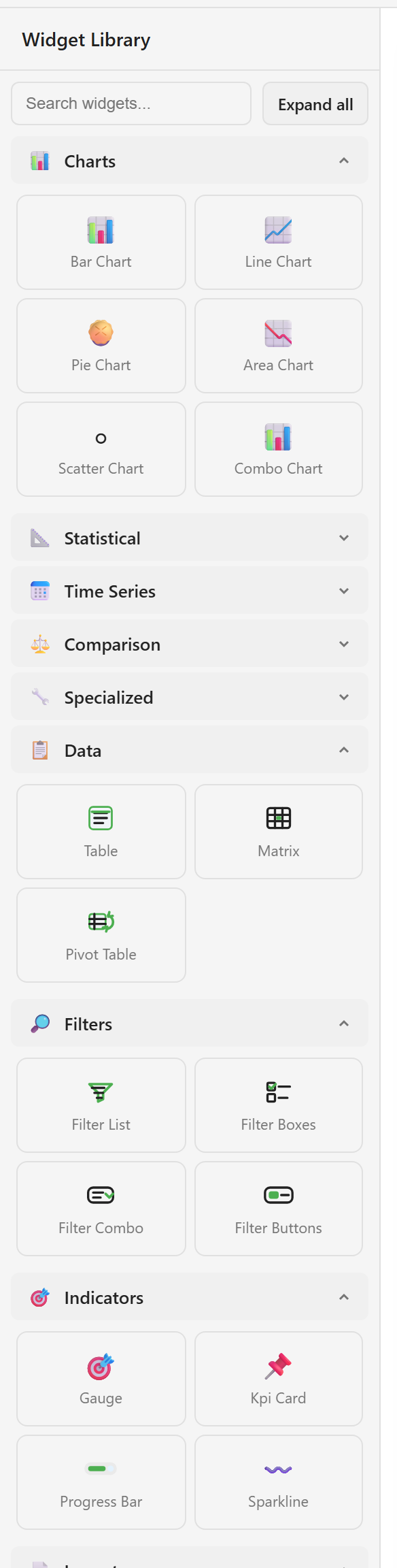
Expand a group and drag the widget you want onto the canvas. Expand all opens every group at once, and the search box at the top searches all of them, which is quicker than working out which group a widget is in. A sparkline, for example, is an indicator rather than a chart.
Widget catalogue lists every type with its group and default size.
The widget appears empty. That is expected — it has no data yet.
Bind columns to it
Section titled “Bind columns to it”Open Data in the toolbar, expand the view or dataset you want, and drag a column onto the widget.
Dragging is the only way to create a binding. There is no dropdown on an unbound widget that lets you pick a column, and the properties panel cannot make a binding from nothing — it only edits one that already exists.
How many columns a widget needs depends on what it is:
| Widget | Drag |
|---|---|
| KPI card, gauge, progress bar | One numeric column |
| Bar, line, area, pie chart | A category column, then a numeric column |
| Scatter chart | Two numeric columns |
| Table, matrix | One column per column you want shown |
| Sparkline | One numeric column, in row order |
Check where the columns landed
Section titled “Check where the columns landed”Select the widget and look at Column Mappings in the properties panel.
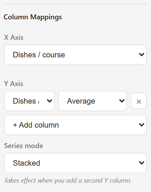
The x axis holds the categories, the y axis holds the values. If a column landed on the wrong axis, change it here — there is no need to delete the widget and start over.
Set the aggregation
Section titled “Set the aggregation”Each numeric mapping carries an aggregation that decides how rows are combined into a single point. It sits next to the column name on the y axis. There are six:
| Aggregation | What it does |
|---|---|
| Raw | No aggregation — one point per row |
| Sum | Adds the values |
| Count | Counts the rows |
| Average | Mean of the values |
| Min | Smallest value |
| Max | Largest value |
Getting this wrong is the most common way a dashboard ends up showing a number that looks right but is not. A card bound to a ratings column with Sum shows a large, meaningless total. The same card with Average shows the rating. Nothing warns you, because neither is an error as far as the widget is concerned.
Check it every time you bind a number. Sum for counts and amounts, Average for rates, scores, and ratings, and Raw only when the source already has one row per point you want drawn.
Add a second series
Section titled “Add a second series”+ Add column on the y axis adds a second measure to the same chart. Series mode then decides how the two are drawn — stacked bars, or side by side. The setting does nothing until a second column exists, and the panel says so underneath it.
Widgets that need no data
Section titled “Widgets that need no data”Text boxes, images, dividers, shapes, callouts, and the rest of the Layout group take no binding. Drag one on and type into it. A heading at the top of a dashboard is a text box, and it is worth adding one — a dashboard that states what it shows saves every reader from working it out.
Copy a widget you have already got right
Section titled “Copy a widget you have already got right”Ctrl+C and Ctrl+V, or the copy and paste buttons in the toolbar, duplicate a widget with its binding intact. Building the second and third KPI card this way and swapping the bound column is faster than building each from scratch, and it keeps the styling consistent.
Arrange the canvas covers sizing and alignment, including how much room a chart needs before its labels start overlapping. How data reaches a widget explains what a binding stores and why the data does not refresh.