
Organise a large chart
A chart that has outgrown its canvas has two ways out. Pages split it into separate views; layers stack detail onto one view. They solve different problems and people reach for the wrong one often enough to be worth spelling out.
Use pages when the content is separate
Section titled “Use pages when the content is separate”The page bar sits under the toolbar. Add page creates another, and the ⋮ menu manages the current one.
Pages suit content that different people read at different times: one page per department, per phase, per environment. Someone reading the deployment page does not need the onboarding page loaded.
Name pages for what they contain. “Page 2” tells a reader nothing.
The common case is a process with a happy path and several exception routes. Put the main flow on page one and the exceptions on their own pages, with an off-page connector marking where they branch. The main flow stays readable, which is the point.
Use layers when the content overlaps
Section titled “Use layers when the content overlaps”Layers in the toolbar shows the layer panel, where you can show and hide groups of shapes.
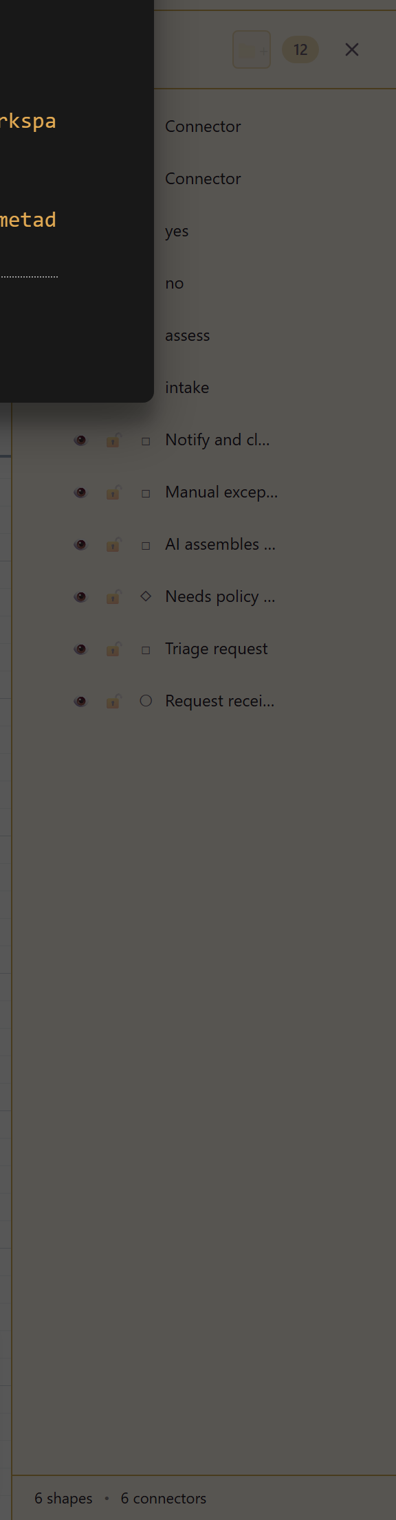
Layers suit content that occupies the same space and is read together or not at all: an annotation layer over a network diagram, a proposed-changes layer over the current state, a compliance-controls layer over a process.
The test is whether the two sets of shapes need to be seen in the same place. If yes, layers. If they merely belong to the same subject, pages.
Do not use either too early
Section titled “Do not use either too early”Both add navigation, and navigation is a cost. A reader who has to find the right page or toggle the right layer is a reader who might not.
One clear page beats three tidy ones. Split when the single canvas genuinely stops working, not in anticipation.
Keep the entry point obvious
Section titled “Keep the entry point obvious”Whichever you use, make it clear where to start. Page one should be the overview, and the layer that is on by default should be the one that makes sense alone.
A chart that opens on a detail page with three layers hidden is a chart people bounce off.
Related
Section titled “Related”Draw a diagram from scratch covers the canvas itself. Designer reference lists the page and layer controls.