
Editor reference
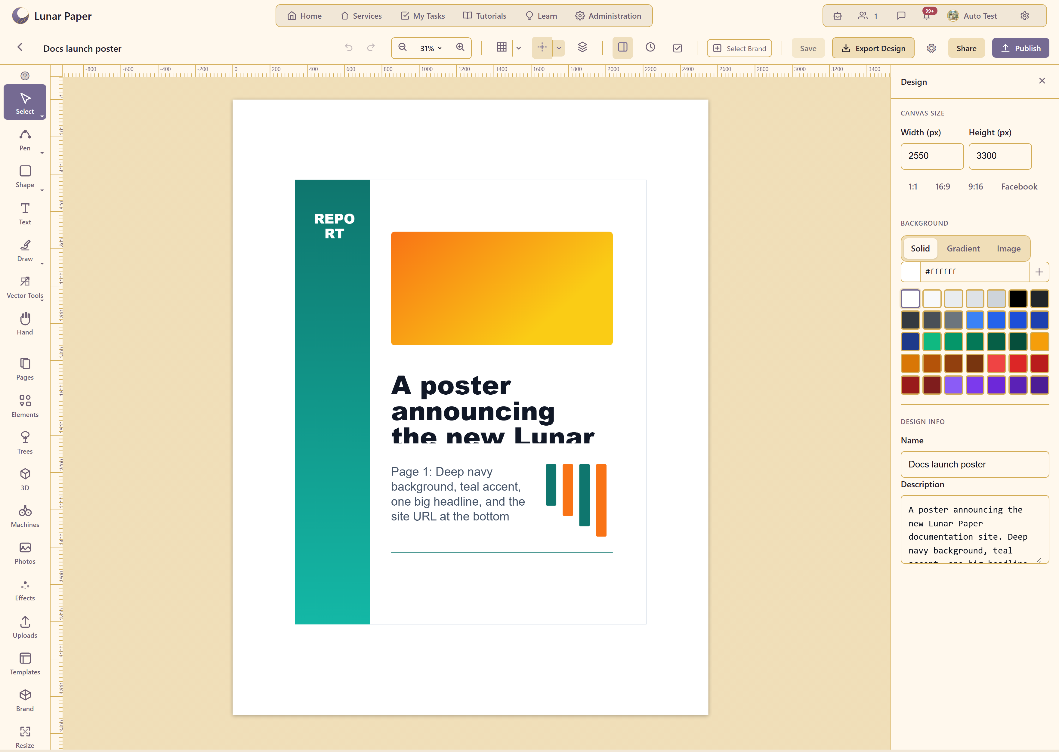
Toolbar
Section titled “Toolbar”
| Control | What it does |
|---|---|
| Back | Returns to the design list |
| Design name | The design being edited |
| Undo / Redo | Step back and forward |
| Zoom Out / percentage / Zoom In | Canvas zoom |
| Toggle Grid, Grid settings | The grid and its configuration |
| Toggle Guides, Ruler and guide settings | Guides, rulers, and their configuration |
| Layers | Stacking order |
| Properties | The selected element’s settings |
| Version History | Earlier states, Shift+H |
| Check design | Preflight |
| Select Brand | Applies a brand kit |
| Save | Saves |
| Export Design | Produces a file |
| Document Settings | Document-level options |
| Share | Access for collaborators |
| Publish | Publishes for readers |
| Find a tool | Searches the interface |
| AI Assistant, Comments | The assistant and discussion |
| Tool | Key |
|---|---|
| Select | V |
| Pen | P |
| Shape | R |
| Text | T |
| Draw | B |
| Vector Tools | E |
| Hand | H |
Panels
Section titled “Panels”| Panel | Supplies |
|---|---|
| Pages | The artboards, with a count |
| Elements | Document elements, data elements, generative systems, twenty professional graphics, shape libraries |
| Trees | A tree generator, vector or photoreal |
| 3D | Editable primitives with detail, colour, finish |
| Machines | Spirograph, pintograph, and rosette curves |
| Photos | Eight included categories |
| Effects | Sixteen animated particle effects |
| Uploads | Your own files |
| Templates | The 21 templates |
| Brand | A brand kit’s resources |
| Resize | Canvas size, with a scaling choice |
Right panel
Section titled “Right panel”With nothing selected it shows the document: canvas size with width, height, and the 1:1, 16:9, 9:16, and Facebook ratios; background as solid, gradient, or image; and design info with name and description.
With something selected it shows that element’s properties, including the settings for a generator placed from Trees, 3D, or Machines.
Related
Section titled “Related”Properties reference lists every control the panel offers, by element type. Capabilities maps each capability to its guide.