
Editor reference
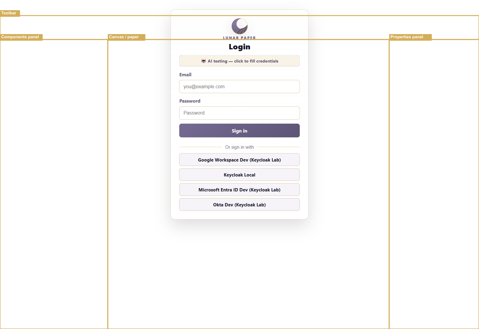
The Document Builder is the editor for Lunar Paper documents. It is split into three columns plus a top toolbar.
Top toolbar
Section titled “Top toolbar”| Button | Purpose |
|---|---|
| Back | Return to the service module view. |
| Document type / title | Shows the current document name. Click to rename. |
| Undo / Redo | Step through edit history. |
| Saved status | Shows the last saved time. |
| Input Variables | Opens the document’s variable list. The badge shows how many definitions are available to insert into text fields and saved templates. |
| Version History | Open the version panel. |
| Publish | Publish the current state as a milestone. |
| Actions | Open export, duplicate, and other document actions. |
| Design | Open the design panel. |
| Comments | Toggle the document comments sidebar. |
| Shortcuts | Show keyboard shortcuts. |
| Share | Copy a link or invite collaborators. |
| Properties | Focus or toggle the properties panel. |
Left panel: Components and Outline
Section titled “Left panel: Components and Outline”Switch between two tabs:
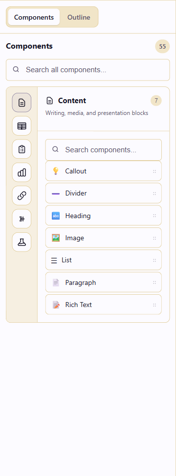
- Components holds all 57 components, grouped into eight categories, including Layout for Page Break and Section Break. Use the search box to find one by name.
- Outline shows the document by headings and component nest levels. Click an item to jump to it on the canvas.
Canvas
Section titled “Canvas”The canvas is the center column. It displays the document as a stack of components on a paper page. Each component has:
- A drag handle (
⋮⋮) for reordering. - A width indicator such as
12/12. - Inline editing fields for its content.
- A toolbar with comment, artifact link, version, and delete buttons.
- Insertion points before and after each component for adding new blocks.
Right panel: Properties
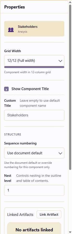
Section titled “Right panel: Properties”The properties panel changes based on the selected component. Common sections include:
- Component type and icon
- Grid Width sets full width, half width, or other column spans.
- Show Component Title turns the component label on or off and lets you rename it.
- Structure holds sequence numbering and nest level.
- Linked Artifacts connects related service artifacts.
- Style Overrides changes the document typography for this component only.
- Danger Zone deletes the component.
Selecting a Section Break shows Break type and Page layout. Choosing Custom layout also shows Paper size and Orientation. Layout breaks are full width and do not use the ordinary title, grid-width or nesting controls. See Layout and page breaks.
Slash command
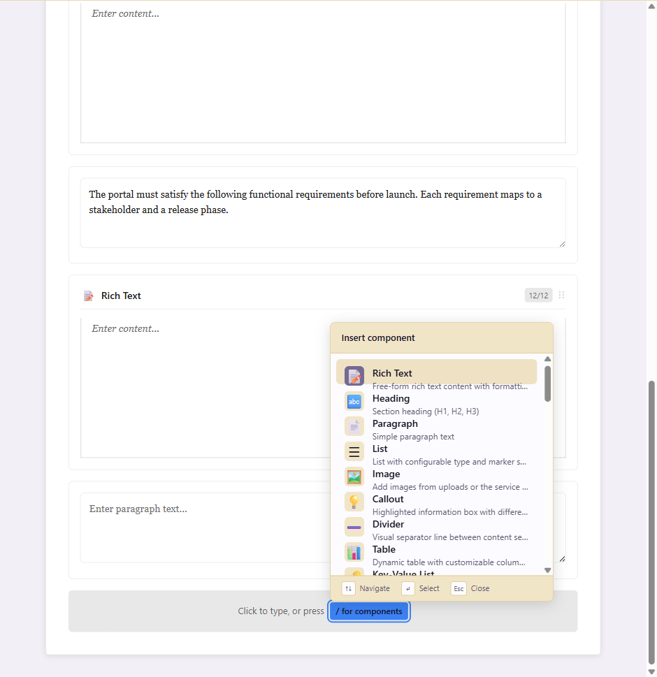
Section titled “Slash command”Press / in any insertion point to open a searchable list of components. Type a few characters to filter, then press Enter to insert.
Beyond the layout
Section titled “Beyond the layout”- Component library reference says what each block in the left panel does.
- Keyboard shortcuts covers the same actions from the keyboard.
- Build content with components puts the editor to work on a real document.
- Build reusable documents with input variables explains the Input Variables panel, token insertion, and template inclusion.