
Map a process end to end
This is the whole job: work out what actually happens, draw it, put real numbers against it, read what the numbers say, and publish it so other people can use it. Allow an hour or two, most of which is thinking rather than clicking.
Before you open the module
Section titled “Before you open the module”Two decisions save a lot of rework.
Decide where the process starts and stops. “Customer request handling” could mean the first email or the moment a case is assigned. Pick a start and an end and write them down. The module traces routes from a Start shape to an End shape, so these two points define everything it will later measure.
Decide whether you are describing today or proposing tomorrow. Map today first, even when the point is to change it. You cannot show an improvement without a baseline, and scenarios exist to hold the proposed version separately.
1. Create the chart
Section titled “1. Create the chart”Open Charts in the service and choose Create Chart, which opens the templates.
Process Map gives you a working example to edit. Blank Canvas gives you nothing. For a first process map, take Process Map and replace its contents — the annotation fields are already filled in, which shows you what good values look like.
Name the chart for the process, not the project: “Support intake”, not “Q3 mapping exercise”.
2. Lay out the happy path first
Section titled “2. Lay out the happy path first”Draw the version where nothing goes wrong, left to right.
Drag Start from Basic Flowchart, then a Process shape for each thing that happens, then End. Do not add decisions yet.
Keep step names as verbs with an object — “Triage request”, “Send confirmation”. A step called “Review” tells the next reader nothing about what is reviewed or by whom.
Five to nine steps is the range that stays readable. If you are past a dozen, some of those steps are really one step, or the process wants splitting across pages.
3. Connect the steps
Section titled “3. Connect the steps”Choose the Connector tool and drag from one shape’s edge to the next.
Label connectors where the reason for the route is not obvious. In the example chart the connectors out of the decision are labelled “yes” and “no”, which is the minimum useful labelling.
4. Add the branches
Section titled “4. Add the branches”Now add the Decision shapes for the points where the work can go more than one way, and draw the routes out of them.
Every route has to reach an End shape. The module traces paths from Start to End, and a route that stops in mid-air is not counted — you will see it as a path that is not complete.
This is also where you find out the process is not what anyone thought. Branches that nobody could describe are the usual discovery, and they are the reason mapping is worth doing at all.
5. Fill in what each step costs
Section titled “5. Fill in what each step costs”Switch to Table view. Each step becomes a row.
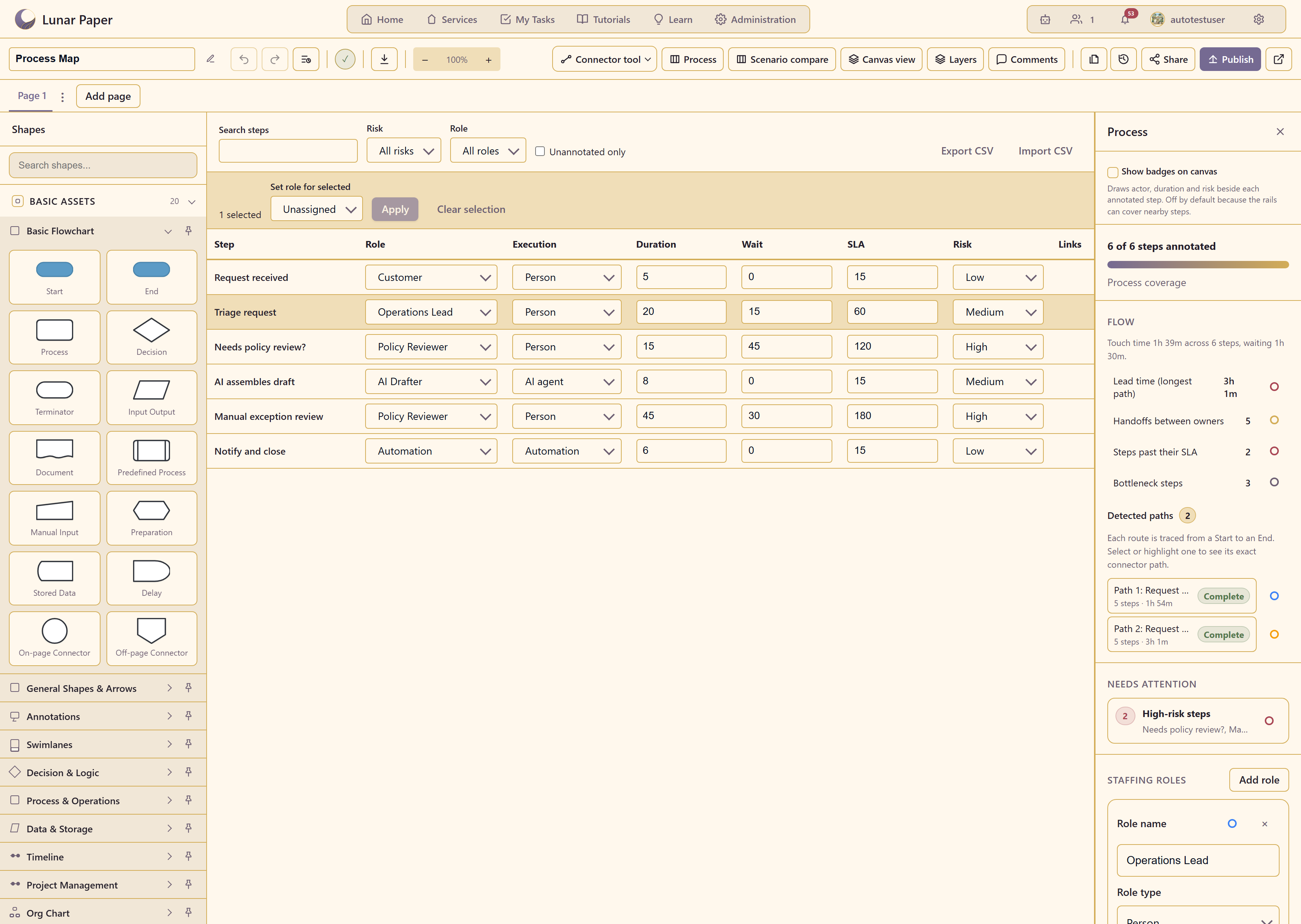
Work down the columns rather than across the rows — set every Role first, then every Duration, and so on. You will be more consistent, and inconsistency is what makes the resulting numbers untrustworthy.
Role is who owns the step. Execution says whether a person, an AI agent, or an automation does it — worth being accurate about, because it is how you later find the parts that could be automated.
Duration is hands-on time. Wait is how long the work sits doing nothing. Most people underestimate wait badly. If a request arrives on Friday and is looked at on Monday, that is a wait of two days, and pretending otherwise will make the chart say the process is fast when everyone knows it is not.
SLA is how long the step is allowed to take. Risk is low, medium, or high.
If you do not know a number, ask someone rather than guessing. A chart with confident wrong numbers is worse than one with gaps, because gaps are visible and wrong numbers are not. Unannotated only filters the table to the rows still missing data.
6. Read what the chart tells you
Section titled “6. Read what the chart tells you”The Process panel updates as you type. Work through it in this order.
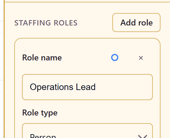
Process coverage first. If it does not say all steps are annotated, the other numbers are only counting part of the process.
Touch time against lead time. Touch time is the work; lead time is the elapsed time along the longest route. In the example, 1h 39m of work takes 3h 1m to get through. That gap is waiting and handoffs, and it is nearly always the biggest and cheapest thing to fix.
Handoffs between owners. Every handoff is a chance for work to stop. Five handoffs in a six-step process means the work changes hands almost every step.
Steps past their SLA and Bottleneck steps name the specific places to look.
Detected paths lists every route from Start to End with its own timing. A process where one path takes twice as long as another is a process where the answer depends on which branch you land in — worth knowing before someone promises a turnaround time.
Needs attention collects the high-risk steps.
7. Sanity-check it with someone who does the work
Section titled “7. Sanity-check it with someone who does the work”Show the chart to a person who actually performs the process, not just the person who owns it.
The reliable question is not “is this right?” but “what happens when it goes wrong?”. Exception paths are where maps and reality part company.
Switch on Show badges on canvas in the Process panel if it helps the conversation — it draws the actor, duration, and risk next to each step. Switch it off afterwards, since the badges can cover nearby shapes.
8. Publish it
Section titled “8. Publish it”Choose Publish, pick the Internal Publisher, and write a version note describing what this version represents — “as-is, confirmed with the support team, August 2026” is more useful than “first version”.
Switch on Allow comments if you want the people who use the process to correct it.
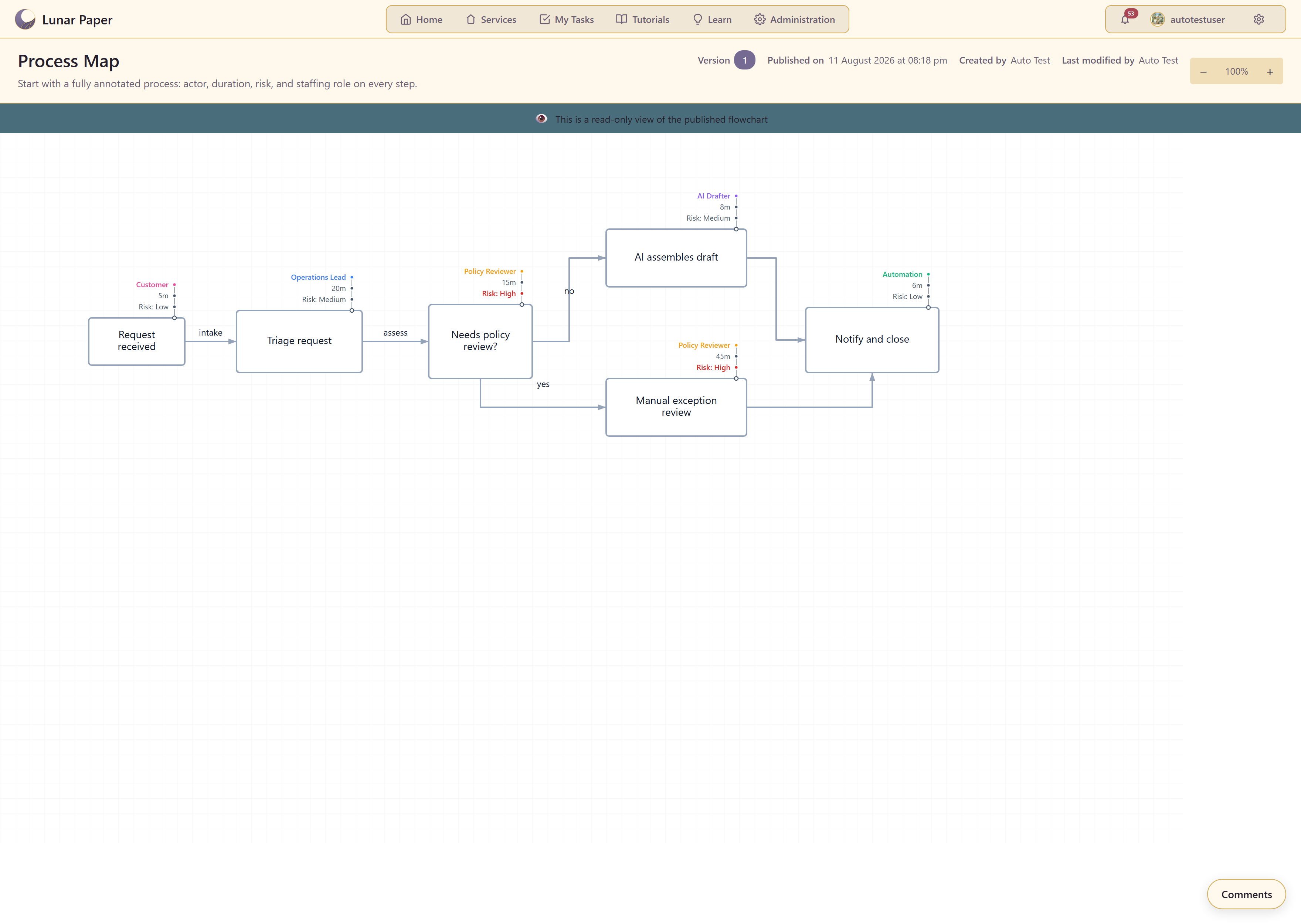
Readers get a read-only copy showing the version, the publish date, and who made it.
9. Put it somewhere people will find it
Section titled “9. Put it somewhere people will find it”Copy link from the chart’s Actions menu gives you the published address.
A process map nobody can find gets remapped from scratch in a year. Put the link where the process is discussed — the team’s page, the runbook, the onboarding checklist.
What you have
Section titled “What you have”A description of how work really happens, with the numbers to back it up, published where people can read it.
Improve a process with scenarios uses this chart as the baseline for a proposed change. Annotate steps in the table covers the bulk editing and CSV tools that make large charts manageable.